Perflo's landing page hid the product behind four tabs. I let the scroll do the showing.
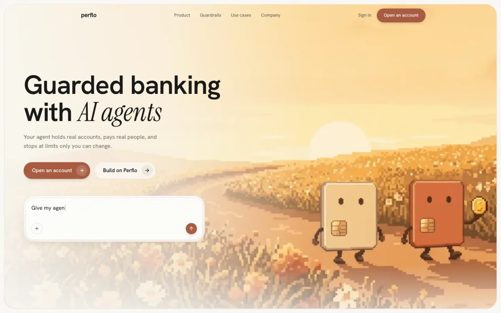
Perflo · Landing page redesign · Solo design + build · Aug 2026
perflo.ai already had a voice: warm paper, pixel-art card mascots, a serif that leans in when a word matters. What it did not have was pacing. The product sat behind four tabs, the story of a payment played inside a diagram, and the page asked you to click to see what it should have shown you. I kept the world and rebuilt the way you move through it.
The live page
Captured from perflo.ai on 8 September 2026, at 1440 and 390 wide.
What the page says today
Perflo pitches two audiences. The live page now leads with builders: the headline is "Give your users' agents secure money access", the primary action is a sales call, and a whole section is given to CLI, MCP and REST snippets. My redesign leads with the account holder, the person whose money the agent spends. That is a positioning choice the company made after this work started, so the comparison below is about structure, pacing and craft, not about which pitch is right.
What both pages share is the world. The live hero is a pixel-art workshop where a builder assembles card-shaped mascots. The footer signs off with "Guarded banking with AI agents" and a repeating pixel skyline. I did not replace any of that. I promoted the footer line to the headline and drew the rest of the page in the same hand.
 Original
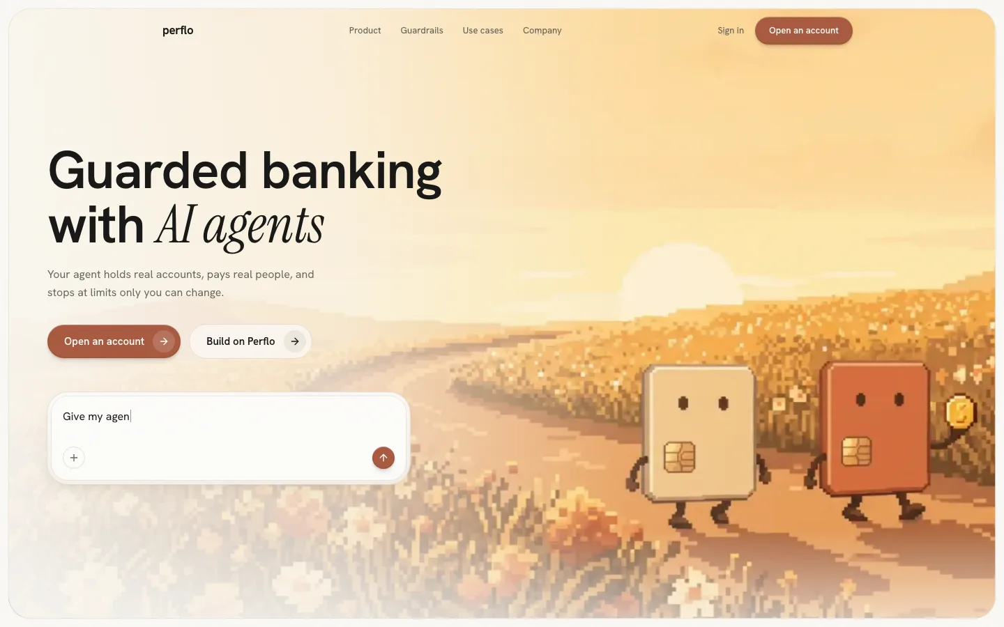 Redesign
The product is behind four tabs
Bank, Card, Pay per use, Plugins. One panel visible at a time, three hidden, and each panel is a dense two-column configurator: a rails list beside a payout form, a card beside its limit table, a price grid beside its caps. It is the app's settings screens wearing a marketing headline. A first-time reader has to click four times to find out what the account is, and nothing tells them the fourth tab exists.
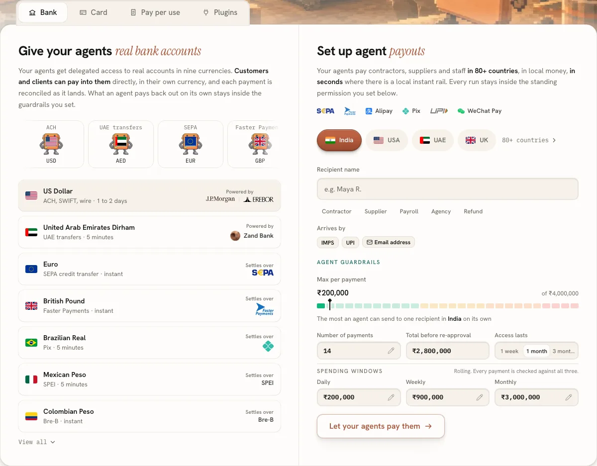 Original
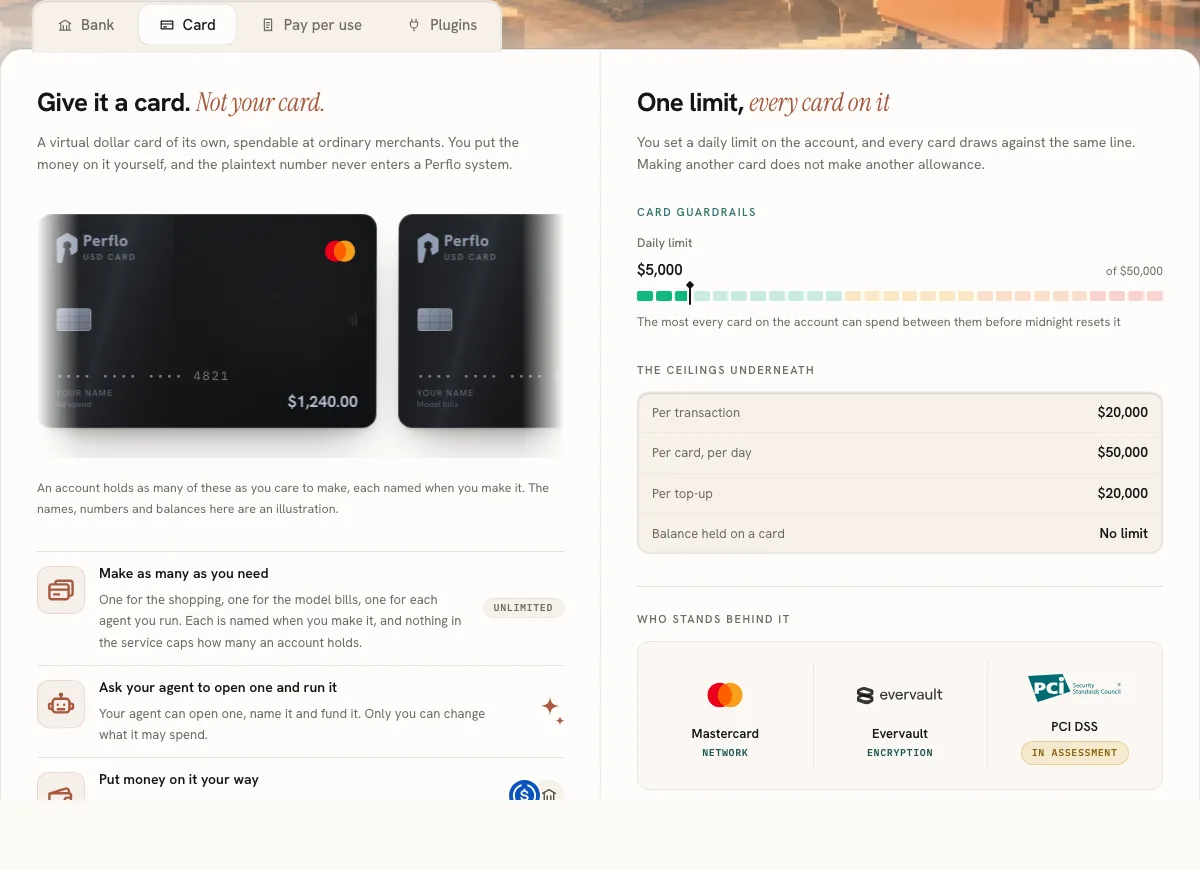 Original
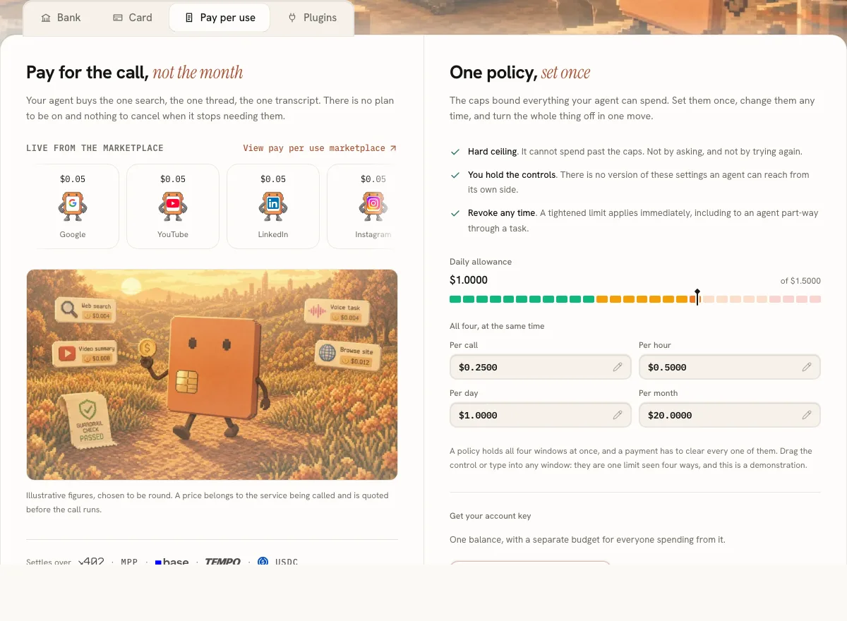 Original
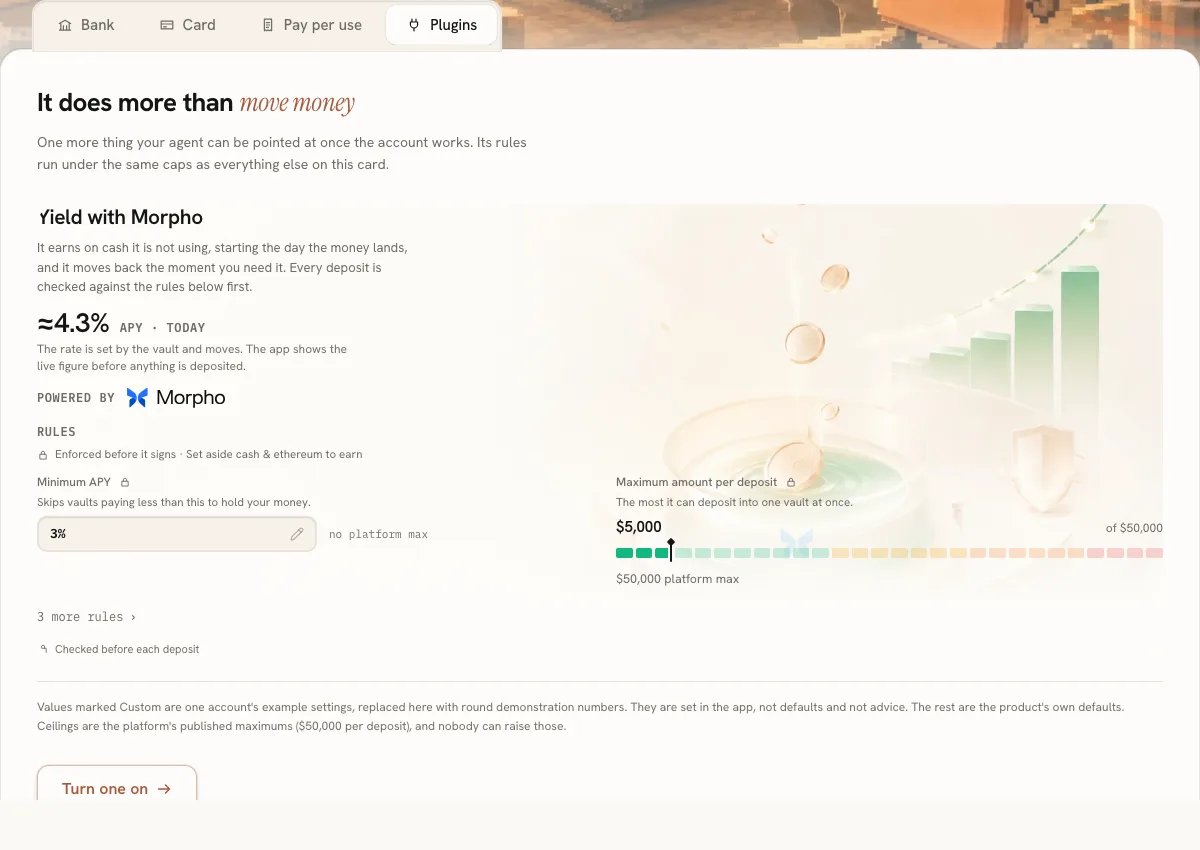 Original
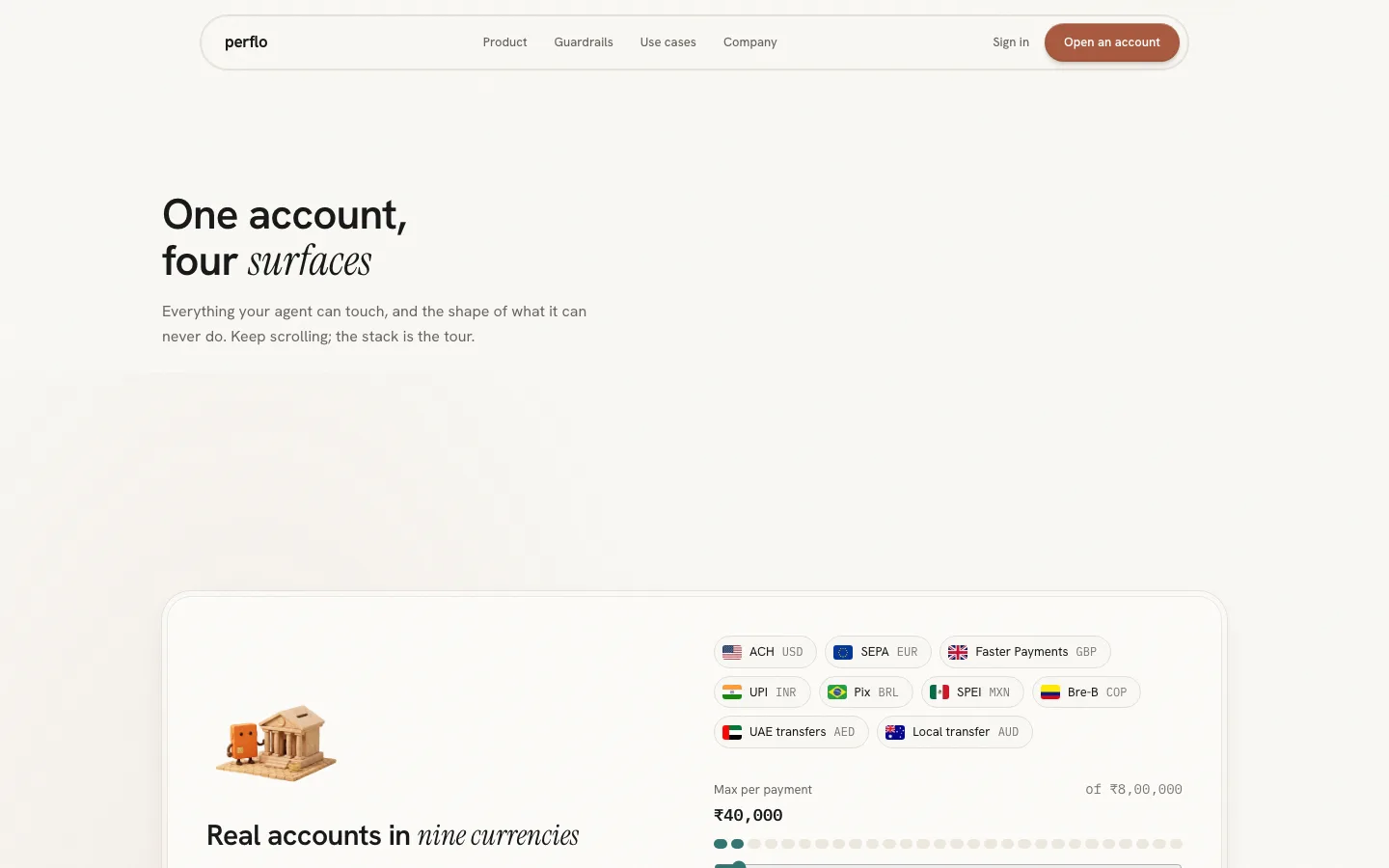 Redesign
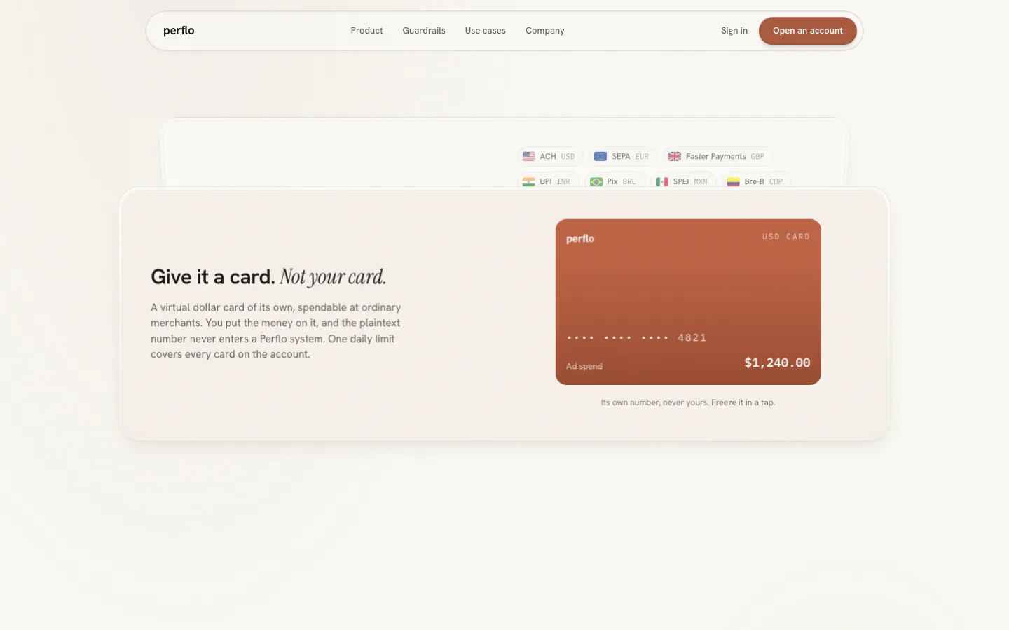 Redesign
The payment story is a diagram
"Guardrails in one view" is the live page's explanation of what makes Perflo different: agent request, rule check, policy engine, human approval, settled. It is a flow chart with a Replay button and a policies card. Correct, and inert. The conversation with the agent, which used to be the page's demo, is gone from the page entirely; Claude survives only in the testimonials.
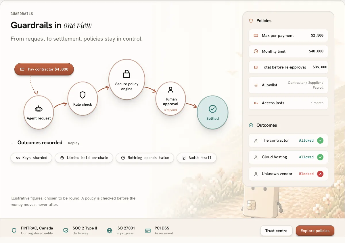 Original
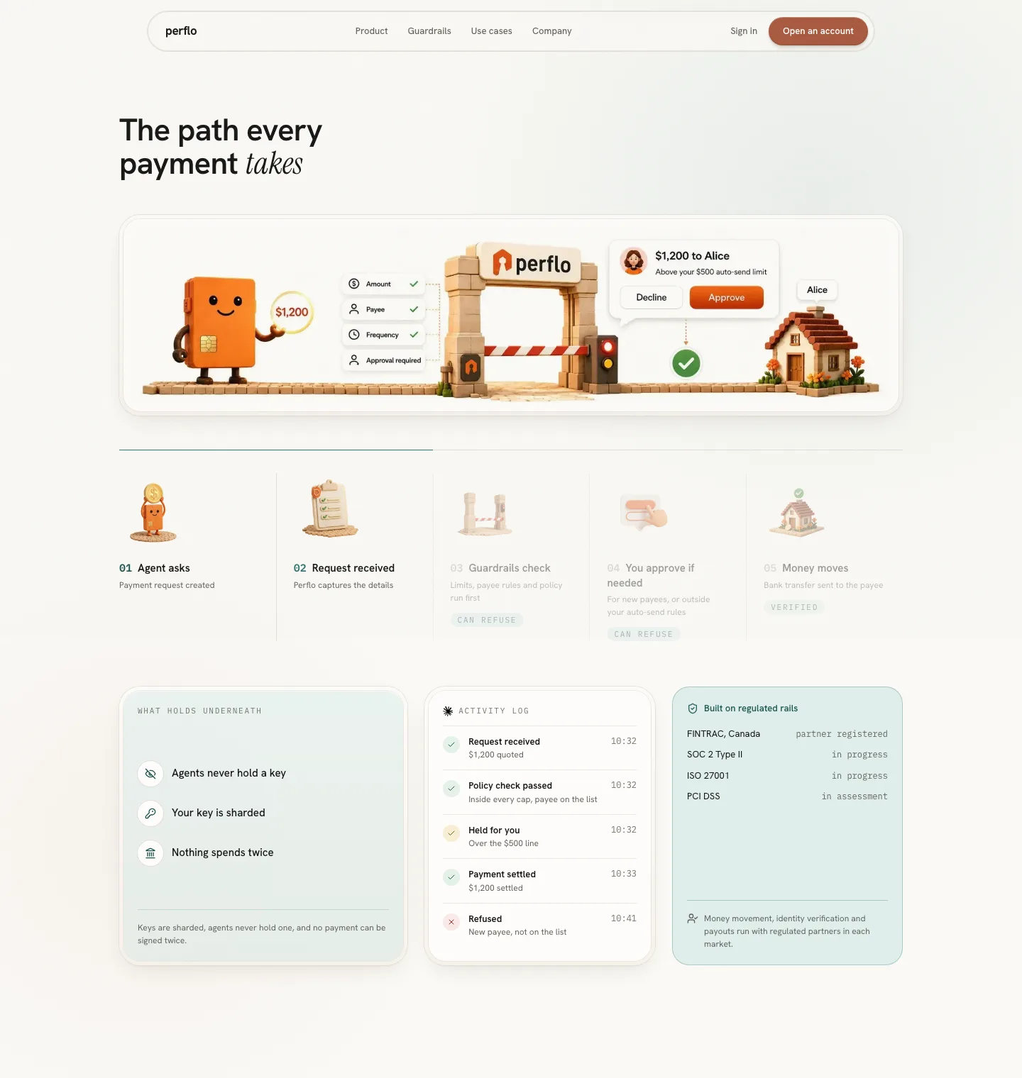 Redesign
What the redesign dropped
The integration panel. CLI, MCP and REST snippets belong in docs, and a page for account holders should not open a code editor halfway down. "Build on Perflo" survives as the secondary action in the hero, one click from the docs. This is the one place the two pages want different things, and I am stating it rather than pretending the redesign covers everything the live page does.
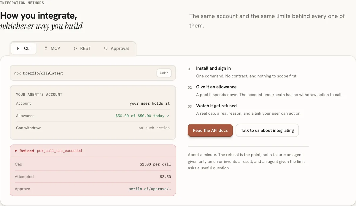 Original
Direction
The rules were set before any section was built. Most of them came from the product, not from me.
Scroll replaces tabs
Four product tabs, a replayable diagram, a testimonial carousel with dots, and a marquee of rails. Every section asks for a click to show its second state.
One scroll. The demo plays as a pinned scene, the four surfaces pin and stack, the automations fly in from depth, the stations light in sequence. One marquee on the whole page, for the connector logos, because a marquee is the honest shape for "1,000+".
- Terracotta acts, teal protects. The product's colour rule, kept exactly. Every button that moves money is terracotta; every surface about limits, keys and refusals is teal. The trust section is the only one washed in teal.
- Same four families. Hanken Grotesk for everything, Instrument Serif italic for the leaning word in a headline, IBM Plex Mono for eyebrows and prices, Doto only for the big counts. The landing adds a larger type scale on top of the product tokens and nothing else; that deviation is written into the design language as the one place the product's 34px ceiling does not apply.
- Paper, while the product ships dark. The marketing surface is light with a film grain over it, so the page has a physical surface even before an illustration lands on it.
- One curve. Every reveal on the page uses the same easing, a small rise, and a blur that clears. Anything needing more choreography owns its own motion and still reads as the same hand.
- Nothing invented. Rails, currencies, caps, partners, testimonials and the pixel skyline are all the live page's own material, re-paced.
Section by section
Nine sections, in page order. Live page on top, redesign underneath, both at 1440.
Hero
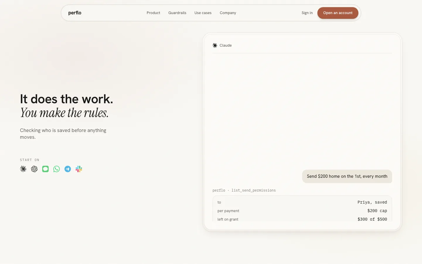
The live hero splits into thirds: copy, scene, and a compliance card competing with the headline. The tab strip is pinned to the hero's bottom edge and belongs to neither section. The redesign gives the headline the full left half, lets the scene breathe as a mounted print with a soft parallax, and replaces the compliance card with the product itself: a prompt box that types "Send $200 home on the 1st, every month" and "Give my agent a ₹4,000 a day card" while you read.
 Original
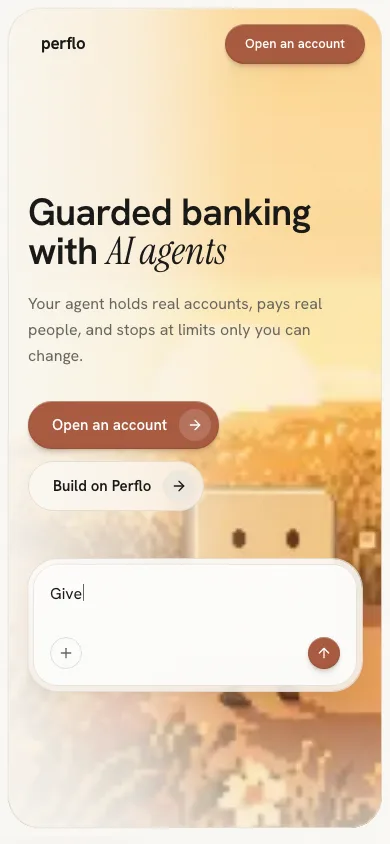 Redesign
The conversation, as one pinned scene
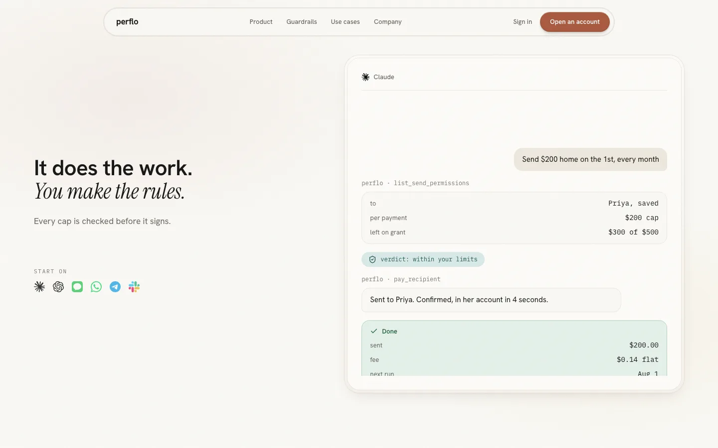
This section has no counterpart on the live page today. The redesign puts the agent's work second, right after the promise: a Claude thread rises from the bottom over six beats while the headline stays put. Request, a permissions check, a verdict inside the limits, a payment call, "Sent to Priya. Confirmed, in her account in 4 seconds", and a standing order toggled on. The caption beside it changes with the beat: "Checking who is saved before anything moves", "Every cap is checked before it signs", "You hold the off switch."
 Redesign
 Redesign
Four tabs become a stack
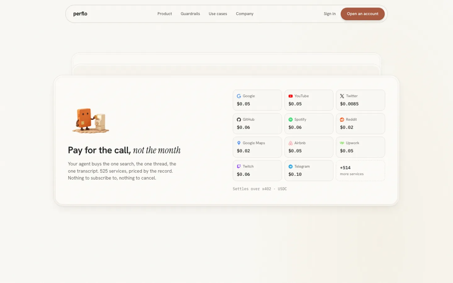
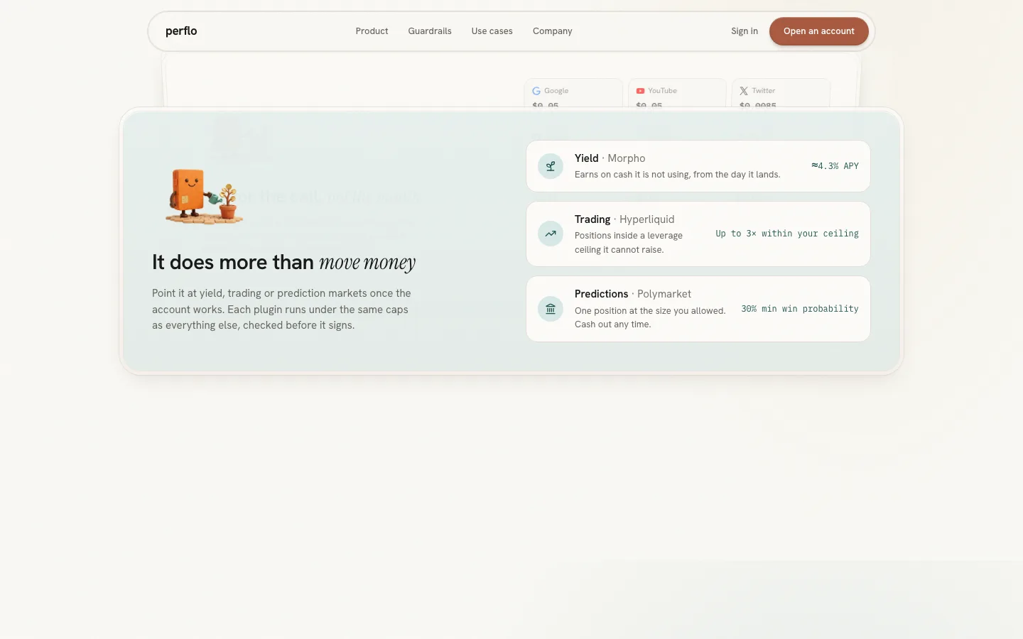
The direct comparison. On the live page each product surface is a tab; in the redesign each is a card that pins under the last one, in 3D, as you scroll. Bank keeps its rails and a guardrail meter you can drag ("This is the whole interface"), Card gets a pointer-tilt render with its own number, Pay per use gets its price grid, Plugins its yield, trading and predictions. Four small scenes were drawn for the panels so each card carries its own picture instead of a stock icon.
 Redesign
 Redesign
The path every payment takes
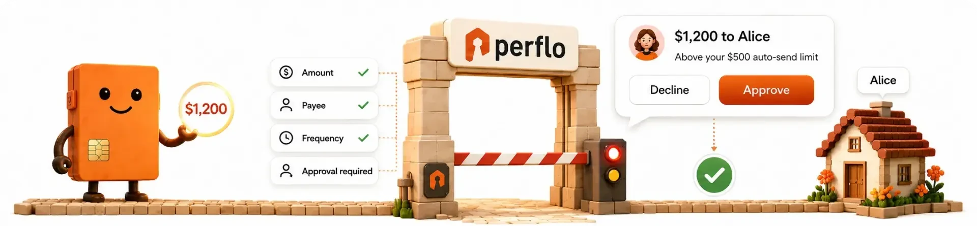
Teal, because this is the protection section. The live page's flow chart becomes a wide illustrated checkpoint scene rendered with a multiply blend so it sits into the paper, then a five-station ledger strip that lights as you scroll: agent asks, request received, guardrails check, you approve if needed, money moves. Under it, three cards the live page spread across the page: what holds underneath (agents never hold a key, your key is sharded, nothing spends twice), a live activity log with a "Held for you" and a "Refused" row, and the regulated rails.
OriginalRedesignYou stay in control
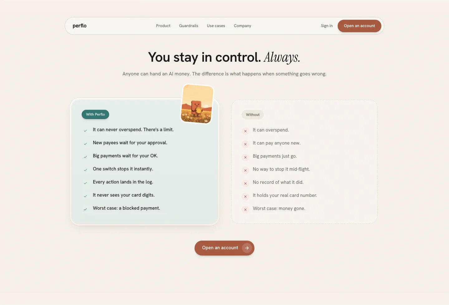
A section the live page implies but never states: what happens when something goes wrong. Two columns, "With Perflo" in teal and "Without" in grey, seven lines each, ending on "Worst case: a blocked payment" against "Worst case: money gone". The mascot holding a coin is rotated on the good card like a wax seal.
 Redesign
Reach
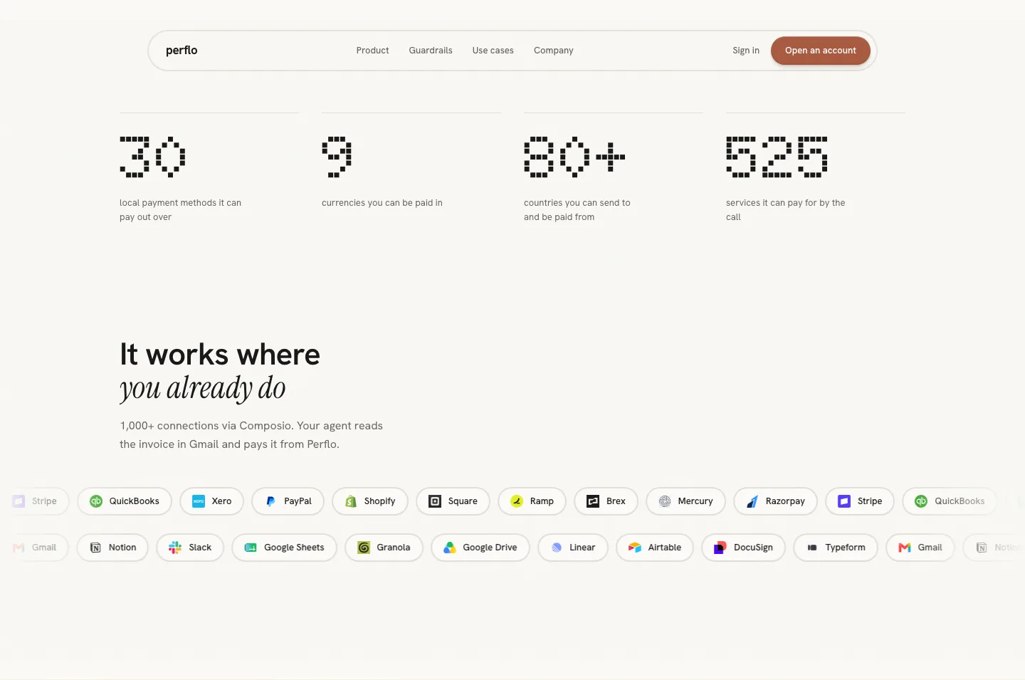
The live page has a numbers row and, elsewhere, a small rails marquee. The redesign puts the counts in Doto, the product's balance face, counting up as they enter, and gives the page its single marquee: two counter-scrolling rows of the connector logos, because "1,000+ connections via Composio" is the one claim that wants to feel endless.
 Original
 Redesign
Flows that run on their own rails
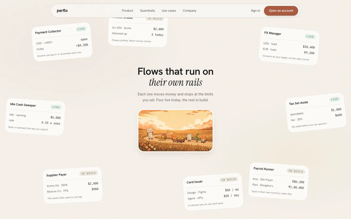
Ten automations, four live and six in build. In the redesign they fly out of depth as a constellation around the headline, scatter, then idle with a slight parallax under the pointer. The mascot scene in the middle shows five of them doing their little jobs along a path. The live page has no equivalent section; automations live in the product.
 Redesign
Community and partners
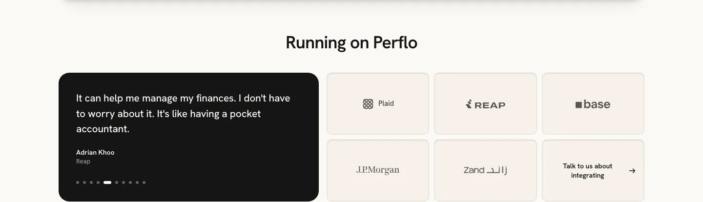
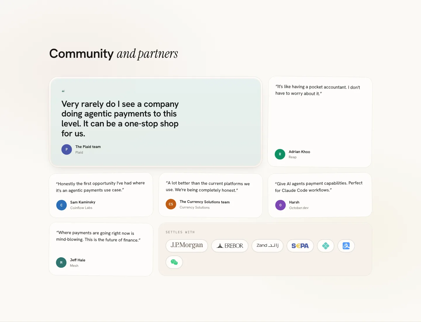
The live page shows one testimonial at a time in a dark carousel with dots, beside a logo grid. The redesign lays them all out at once: a featured teal pull-quote from the Plaid team, five tilted cards with monogram seals, and a "Settles with" plate for the rails. No dots, nothing to advance.
 Original
 Redesign
Footer
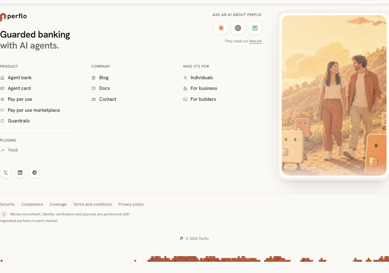
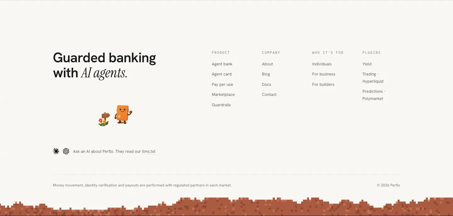
Kept almost whole. The live footer already had the best line on the page and the pixel skyline. The redesign restates the line, replaces the couple-on-a-path photo scene with the mascot waving from the end of a cobblestone path, and keeps the band.
 Original
 Redesign
The illustrations
Fifteen scenes, generated with Higgsfield using Nano Banana Pro, in the live page's own language: card-shaped robot mascots, a warm autumn valley, pixel edges. Each one was drawn for a specific slot, at the aspect ratio of that slot, then re-encoded to webp for the page.
One world
The five large scenes and the band. Each has a job on the page, and one was cut.






Eight small scenes
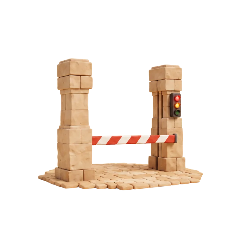
Five for the payment path, one per station, and three for the surface panels. All square or near-square, drawn to read at 96px.







Recorded, not hidden
The product's design language says: flat warm grounds, no photography, no illustration, no repeating pattern or texture. The landing page breaks that on purpose. Illustration is the single largest aesthetic departure on this page, and it is written into the design language's deviations table with the reason: a landing page has to shout once, the app never does. Same four families, same curves, same colour tokens. Only the canvas is larger.
Motion
Every animation on the page has a reduced-motion branch that is a real alternative, not a suppression.
One curve, three pinned scenes
- The chat story, the surfaces stack and the automations constellation are pinned 420vh scenes driven by scroll position. Below 768px they collapse to plain flow, explicitly, instead of trying to pin on a phone.
- Reveals share one curve and one distance: a 24px rise and a blur that clears in 0.8s. Headlines print line by line out of a clipping mask.
- The hero leans toward the pointer and zooms with the scroll. The card tilts under the pointer. The stations light in sequence. None of it travels far.
- The counts are the only numbers that animate, and they animate once.
Process
Built as the marketing front of the same Next.js app that carries the product redesign, on the same tokens.
Same repo, same lint
The landing is a route in the Perflo app, mounted at the site root, with the product moved under its own path. It shares the design tokens, the four font families and the motion primitives with the app, and adds one CSS layer of its own for the larger type scale and the paper materials. The token lint that guards the app guards the landing too: no raw hex, no raw px, no fifth font.
| Check | Result |
|---|---|
| TypeScript, strict | clean |
| Design-token lint (no hex, no px, no extra fonts) | 0 errors |
| Production build | green, served at kishor.design/perflo |
| Reduced-motion branches | every reveal, every pinned scene |
| Mobile collapse of pinned scenes | explicit, below 768px |