Perflo's app answered one question in four navigations. I gave it one.
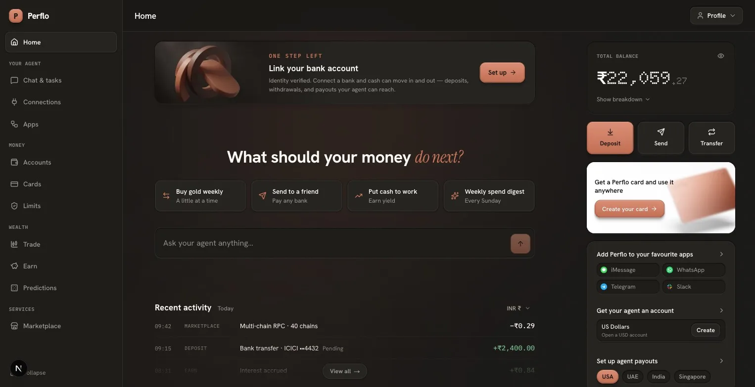
Perflo · App redesign · Audit, design language, shipped front-end · Aug 2026
Perflo is a money app where an AI agent is a first-class account holder. The interface has to answer two questions at all times: how much money is there, and what is the agent allowed to do with it. This is the record of auditing the live product, defining a design language for it, and rebuilding its core screens, with the direction given at each step and the reasoning behind it.
The audit
Every flow of the live product walked end to end, with small real payments where a flow demanded one. 46 annotated screenshots, findings rated on Nielsen severity.
Four parallel navigations
The product's features were largely sound. What was broken was the information architecture: the same objects kept reappearing under different names in different navigations, so the two questions the app exists to answer had no single, reliable place to be answered.
Four navigations existed at once, and they were parallel: each re-grouped the same destinations under different names, so nothing had one canonical home. To see why that's a problem, follow a single concept, your money, through all four. It is highlighted in each screenshot.
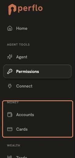 Original
 Original
 Original
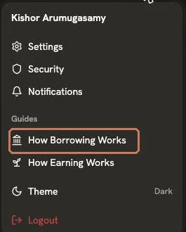 Original
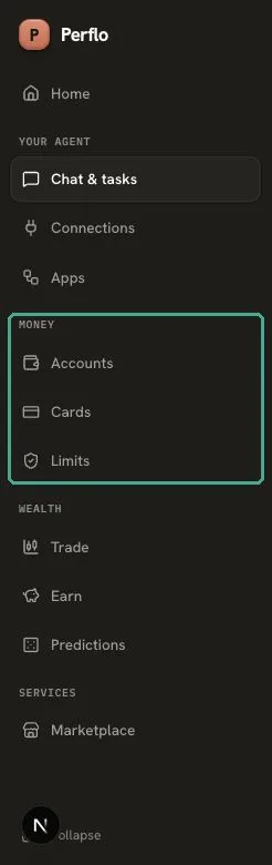 Redesign
Seven names for one balance
The same ₹1,048.95, promotional credit, answered to a different name on almost every route. Six of the seven are captured here; only "Free credit" discloses what the money actually is.
 Original
 Original
 Original
 Original
 Original
 Original
 Redesign
Permissions and Spending, two screens editing one object
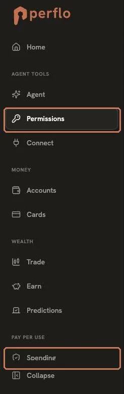
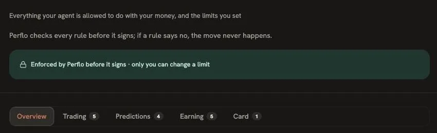
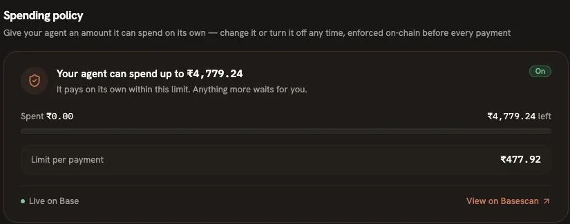
The sidebar carried both a Permissions screen (under Agent tools) and a Spending screen (under Pay per use). Both edited the same rules about what the agent may pay, each with its own Change and Turn-off controls, with no sign they were the same thing. The workspace carried a third, summarised copy.
 Original
 Original
 Original
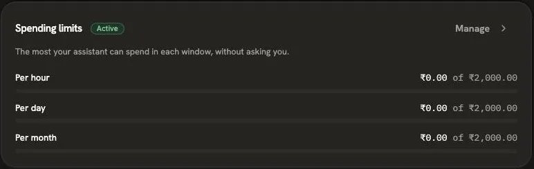 Original
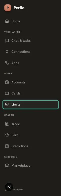 Redesign
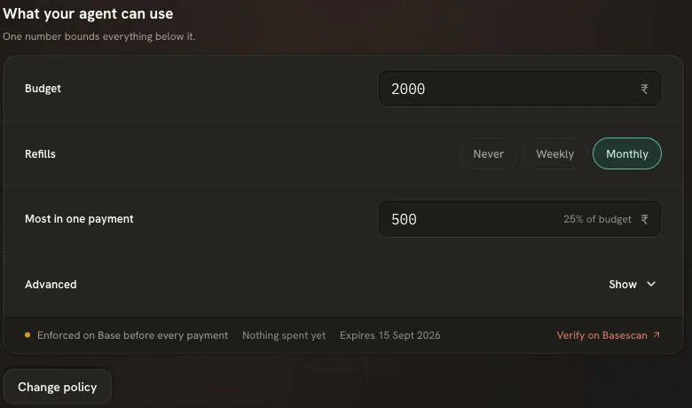 Redesign
Fifteen rules across four tabs
Each tab its own page-state, plus advanced drawers below. A reader auditing "what can my agent do" had to open every one.
 Original
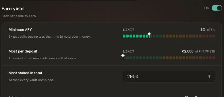 Redesign
"Connect" and "Connect Apps" point in opposite directions
Sidebar Connect attached an assistant to Perflo; workspace Connect Apps attached apps for the agent to use. Near-identical names, inverse relationships, different navigations.
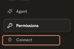 Original
 Original
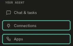 Redesign
Beyond these: the transaction history lived at a route the nav called something else, and a failed payment left no trace in it at all. The redesigned ledger on Accounts records the failure, with its reason, as the first row.
Design direction
The brief, set before any screen was rebuilt.
Five rules before the first screen
- An agent spending money is a new concept, so the UI must be simple and clear. This is an app people check often: monitoring first, but with quick actions in reach.
- Agent interaction first, balance second. Onboarding and quick actions live in the rail, not the centre of attention.
- One navigation. Every object gets one home; every other screen that mentions it links there instead of re-rendering it.
- Nothing invented. Every feature of the original survives. The redesign reorganises, it does not remove. Each element maps to a design-system equivalent rather than a new invention.
- Plain language. Gold, cash, bitcoin. Never tickers, chains or addresses on the surface.
A dedicated design system was built in Claude Design and imported as the single source of truth: tokens for colour, type, spacing, elevation and motion, enforced by lint. No raw hex, no raw px, no fifth font. Its central convention is a colour semantic the whole product obeys.
Terracotta means action. What moves money: buttons, activity, the agent at work. The activity graph is terracotta because it is nothing but actions.
Teal means protection. What constrains money: limits, trust surfaces, what the agent can never do. Never swapped with action.
The redesign, screen by screen
Each screen lists the direction given and what shipped from it.
Home
The first attempt reproduced the original's layout and was rejected for exactly that: cluttered, no personality, flat hierarchy, everything on one page. The reset began with a question instead of a screen: what does this page even need to show?
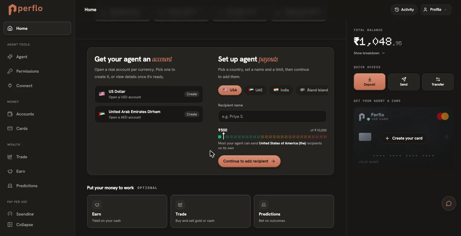 Original
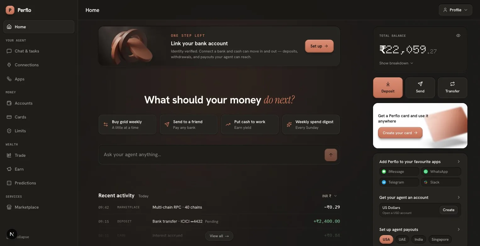 Redesign
Direction given
- Centered agent conversation as the primary surface; balance secondary.
- Right rail: card teaser as a blurred image banner ("Get Perflo card and use it anywhere"), setup steps as short separated rows with hover highlights, currencies as a card stack, real channel logos.
- Recent activity capped at three visible rows, bottom-aligned, with a fade that only reads "there is more" when there genuinely is.
- Ambient warmth: a soft glow gradient with noise, in the same tone.
Navigation, four taxonomies become one
Sidebar + Accounts tabs + workspace tabs + profile menu, each grouping the same concepts differently.
One sidebar grouped by the job the reader came to do: Your agent · Money · Wealth · Services.
- "Permissions" and "Spending", two editors for one object, collapse into a single destination, Limits. Everything else links to it.
- "Connect" and "Connect Apps" become Connections (what drives the agent) and Apps (what the agent drives). Two words, two directions, no collision.
- Direction. Limits belongs with money, not buried under agent settings, so it moved into the Money group. And the money screen returned to its original name, Accounts (labels and titles only; the URL kept, so no link breaks).
Limits, one home for every rule
The only route that can change what the agent may do. It absorbs the original's 15 rules across four permission tabs, the spending policy, budget, windows, expiry and balance. Nothing dropped.
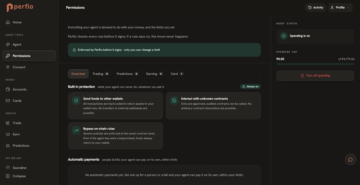 Original
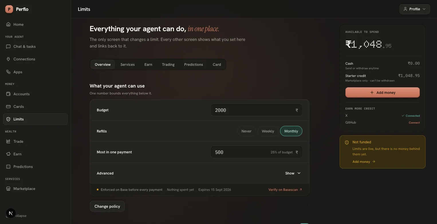 Redesign
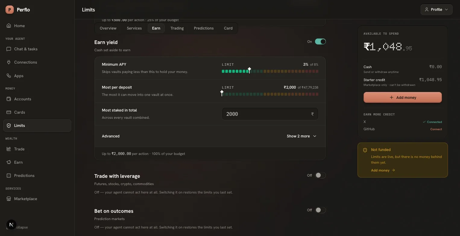 Redesign
Direction given
- Layout from hand-drawn wireframes: label-and-input rows in a two-column grid, short field heights, horizontal separators. Cleaner than any invented arrangement.
- Horizontal section tabs under the headline (Overview, Trading, Predictions, Earning, Card) that highlight as the page scrolls.
- Per-payment amount adjustable; every individual limit the original had (max leverage per trade, max per trade, per-bet caps) present and adjustable; balance card in the right pane.
- Adjustable rules render as sliders in the design system's segmented meter language: 28 segments on a low-to-critical risk ramp with a diamond pointer, made interactive with keyboard, drag, and snap-to-steps for stepped rules like leverage and APY.
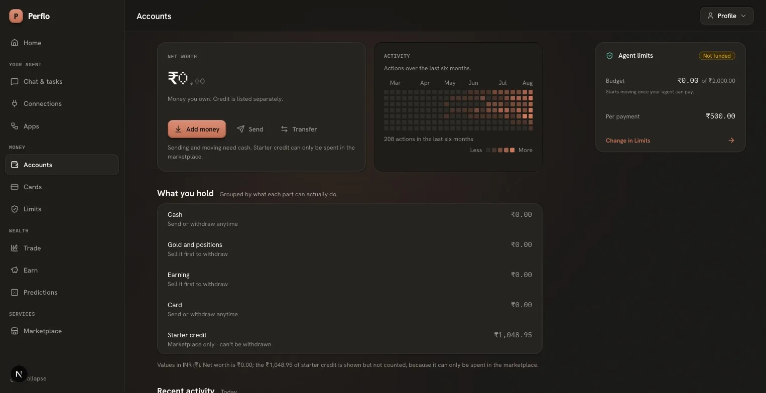
Accounts, one balance, one name
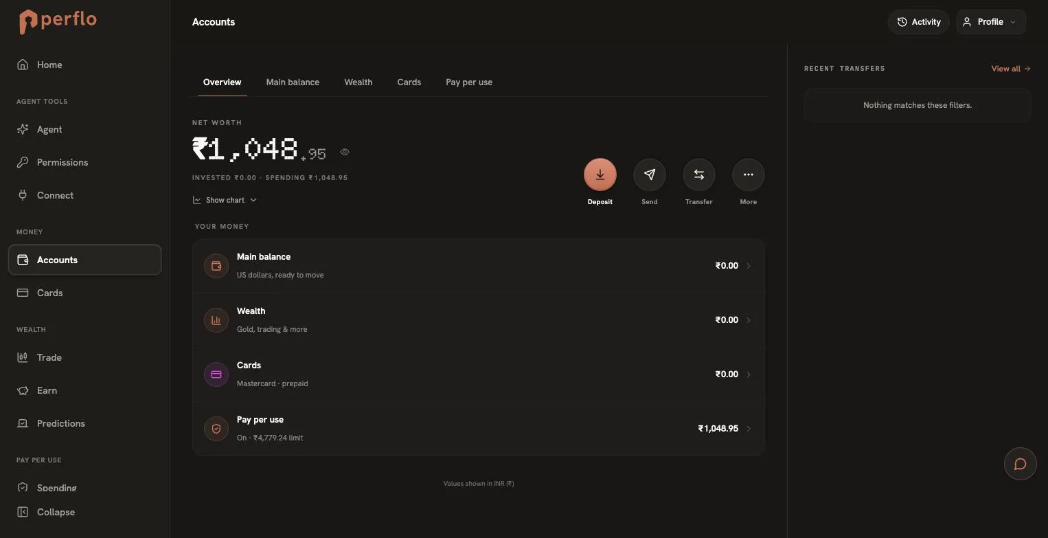 Original
 Redesign
Five tabs restating the sidebar; ₹1,048.95 answering to seven names; credit silently mixed into totals.
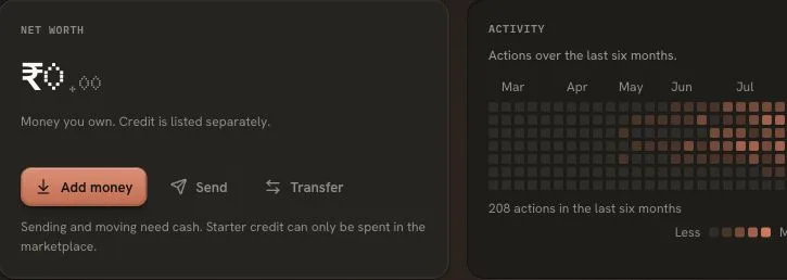
One screen. Every figure renders with its qualifier attached; credit is shown beside net worth, never inside it.
- Send and Transfer disable themselves, with a stated reason, when the balance is entirely non-withdrawable credit. The original rendered that state as live controls.
- Direction. A GitHub-style activity graph leads the page: six months of the agent's actions, day by day. Iterated to direction: moved to the top, made denser and full-width, rebuilt on
react-activity-calendarwith per-day details on hover, served by the product's own tooltip. - The transaction ledger lives here too. Where the money went belongs on the money screen, including declined payments with their reason.
Chat and tasks, the workspace joins the app
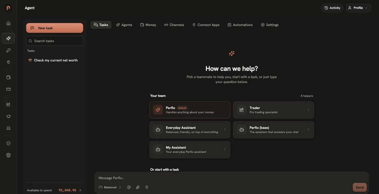
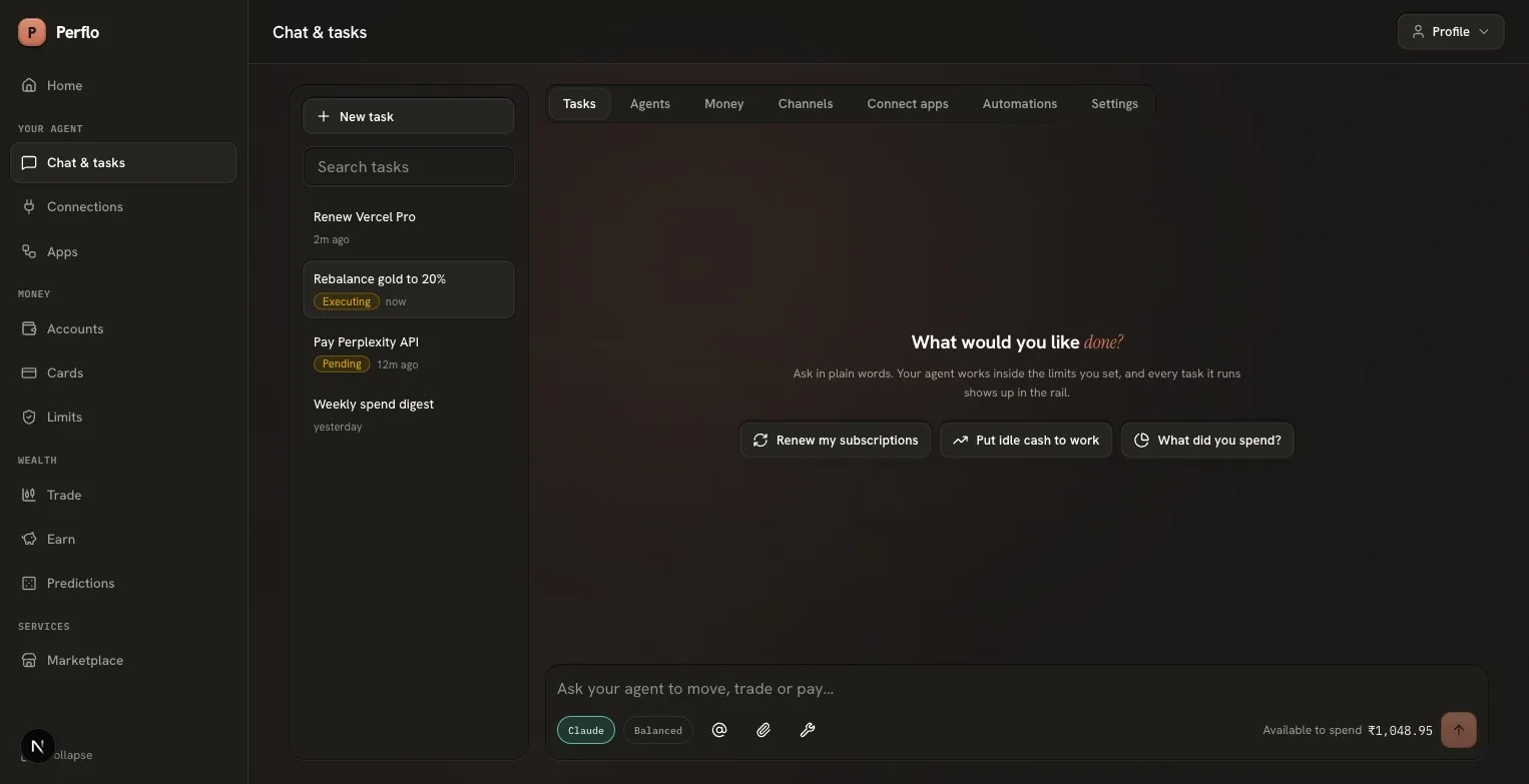
The original agent workspace replaced the entire shell, the only screen that did. Rebuilt inside the shell so orientation never resets: task rail with search, message thread, and a composer that shows available to spend right where spending is asked for.
 Original
 Redesign
- Direction. The workspace keeps its own tab row (Tasks, Agents, Money, Channels, Connect apps, Automations, Settings) and drops the decorative header. Sections without content say so plainly instead of dead-ending.
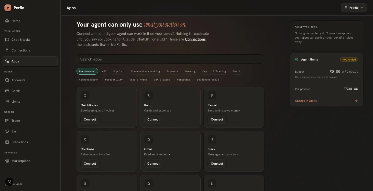
Apps, the original catalog, kept
 Original
 Redesign
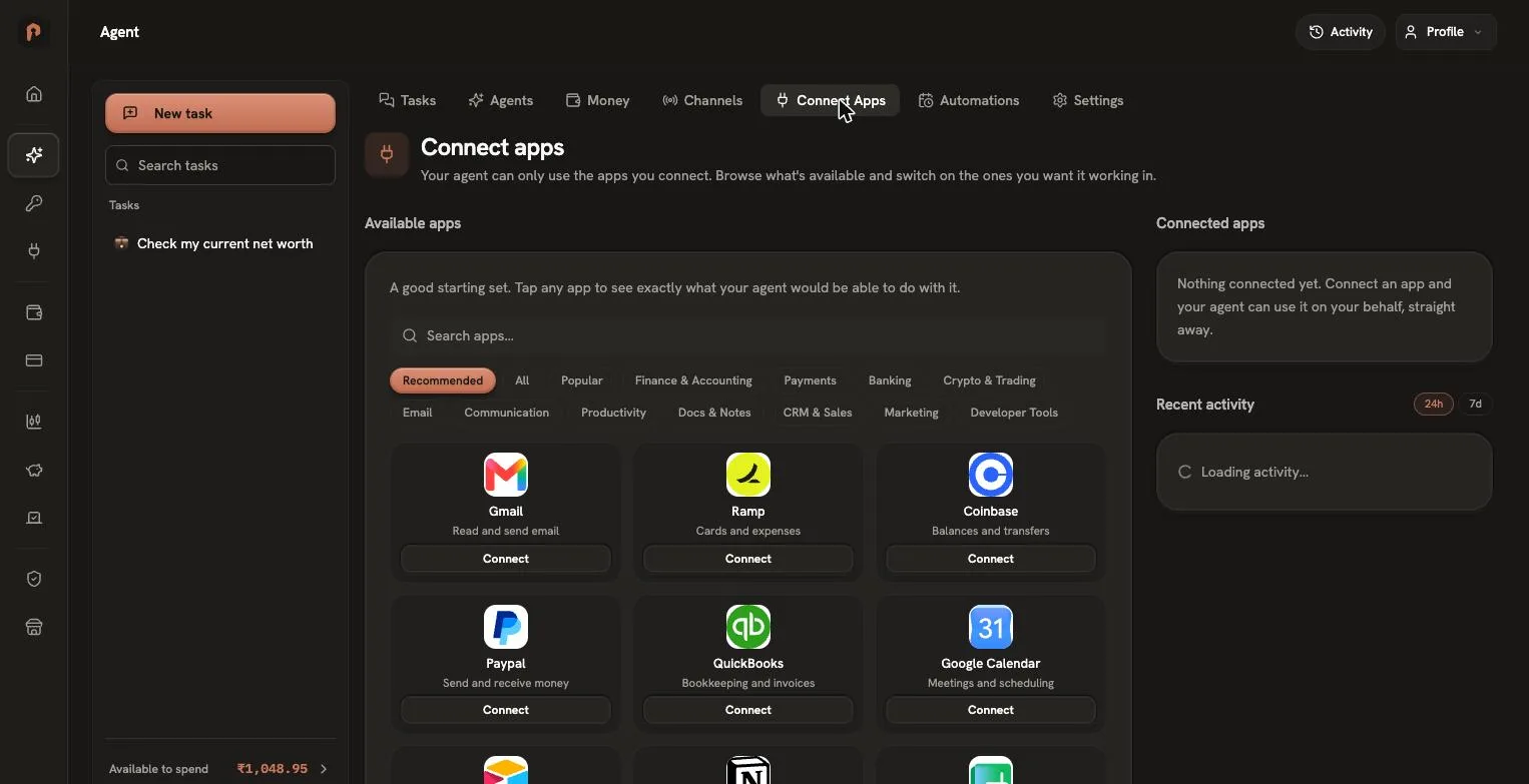
- Direction. The original's app directory was richer than the first redesign pass: more apps, properly categorised. Use the same.
- Rebuilt from the audit screenshots: the original's exact filter taxonomy (Recommended, All, Popular, then eleven categories from Finance & Accounting to Developer Tools) and a 29-app catalog whose Recommended set opens with the original's own grid: Gmail, Ramp, Coinbase, Paypal, QuickBooks, Google Calendar.
- Search across the whole catalog with a no-match state; monogram tiles instead of counterfeit brand logos, since the product ships no brand assets.
Process
Designer-directed, agent-executed.
Audit, direct, verify, repeat
The build ran as a directed loop: audits through live browser automation of the real product, implementation delegated to AI coding agents on pre-selected models, and every round gated by machine checks (type-check, lint, production build) plus screenshot review in the running app before any change counted as done. Rejected passes were rejected in writing, with wireframes where words weren't enough; the design system's lint rules made the token discipline non-negotiable rather than aspirational.
| Verification | Result |
|---|---|
| TypeScript, strict | clean on every round |
| Design-token lint (no hex, no px, no extra fonts) | 0 errors |
| Production build | 9 static routes, green |
| States shipped with the happy path | empty, loading, disabled-with-reason |