Letting traders set up their own screen, because no single layout fits
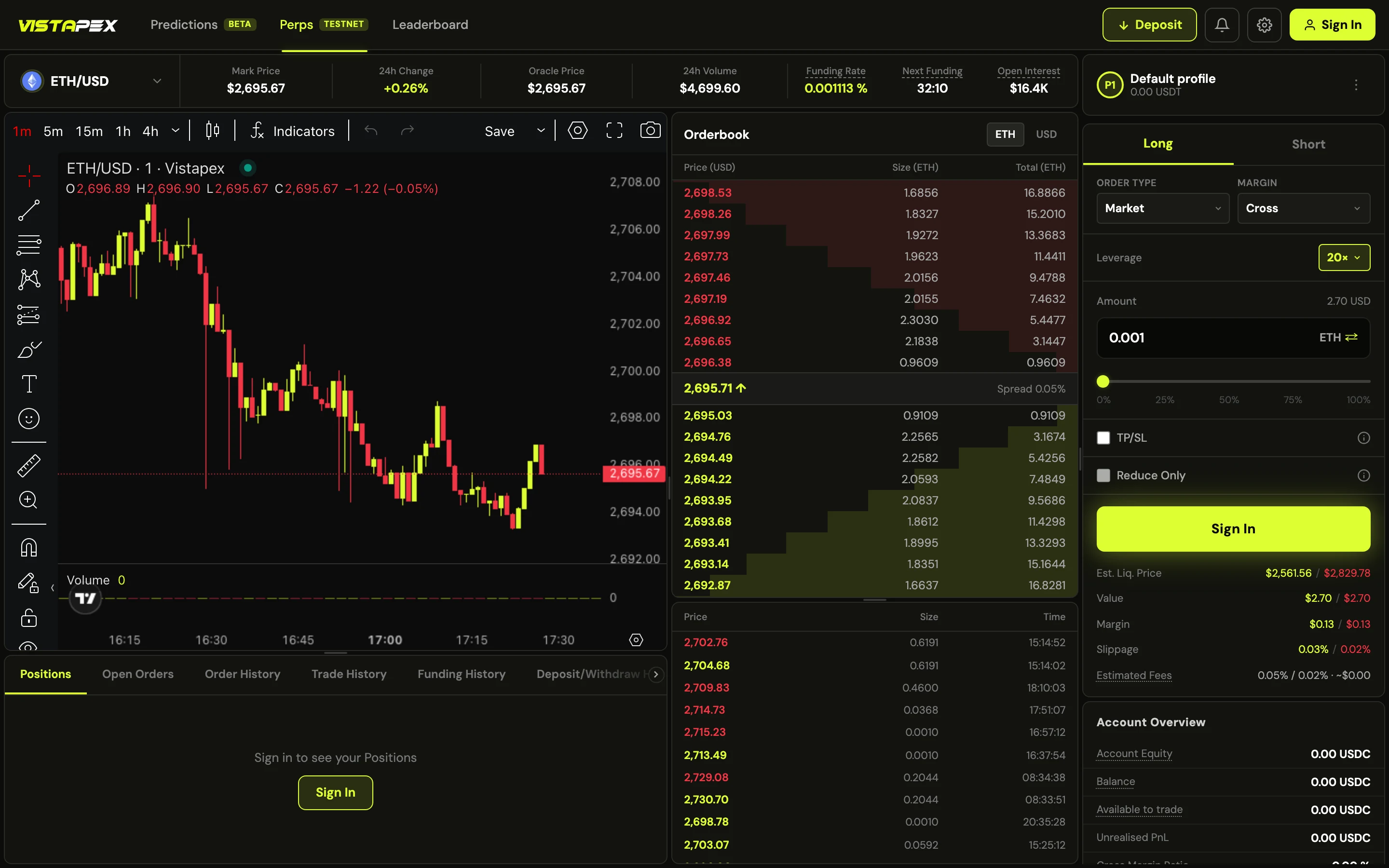
Vistapex: the brand, the waitlist site and the trading app. I designed them and built the app’s front end alone.
- Role
- Solo designer, app front end
- Year
- 2026
- Scope
- Brand, website, trading app
- Result
- $1.63B traded in two weeks
Designing for two traders who want opposite screens
Too much on screen makes a first time trader freeze and leave. Too little reads as a toy to an expert, and nobody trusts a toy with money.
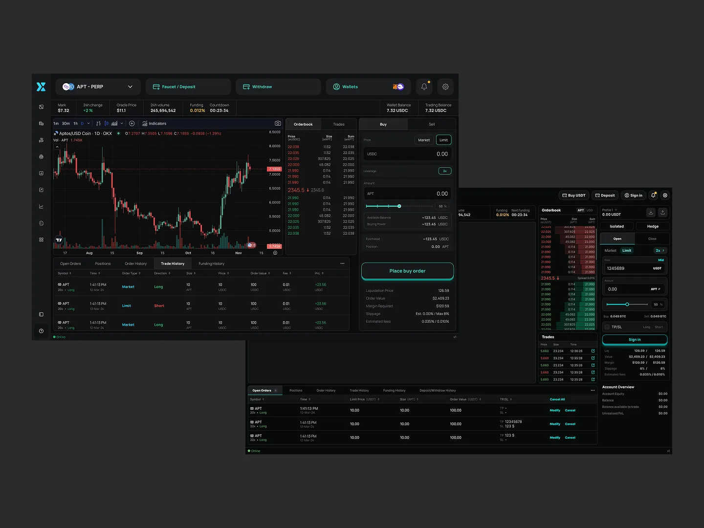
Iterating for three weeks, until the data ended the guessing
I assumed it was a craft problem. Every version was fine, and every version lost someone.
- FirstDense and completeThe version I was proud of.
- ThenPushed and pulledSpacing out, spacing in, recoloured, re-weighted twice.
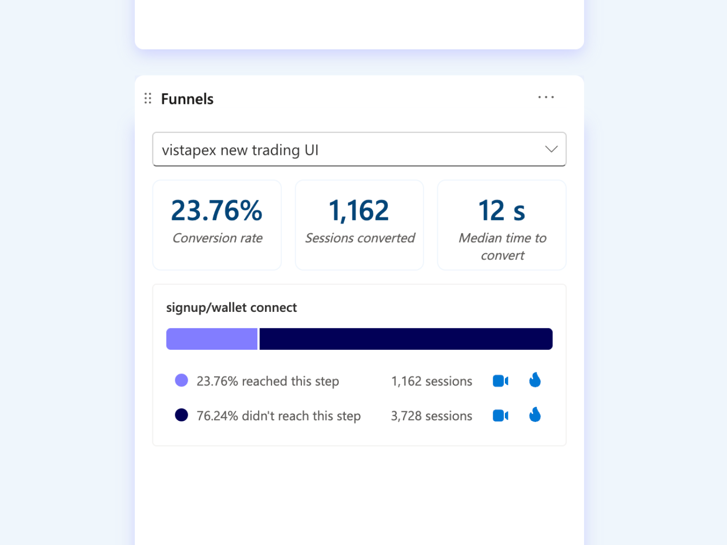
- ClarityThe recordingsThe dense screen buried first time traders.
- AfterSimplifiedToo thin for experts, so it read as untrustworthy.
- DecisionStop choosing for themThe right screen was never mine to pick.
Trusting session recordings over my own eye
Two versions, each fixing the problem by breaking it for the other half. That is when it landed: there was no right design.
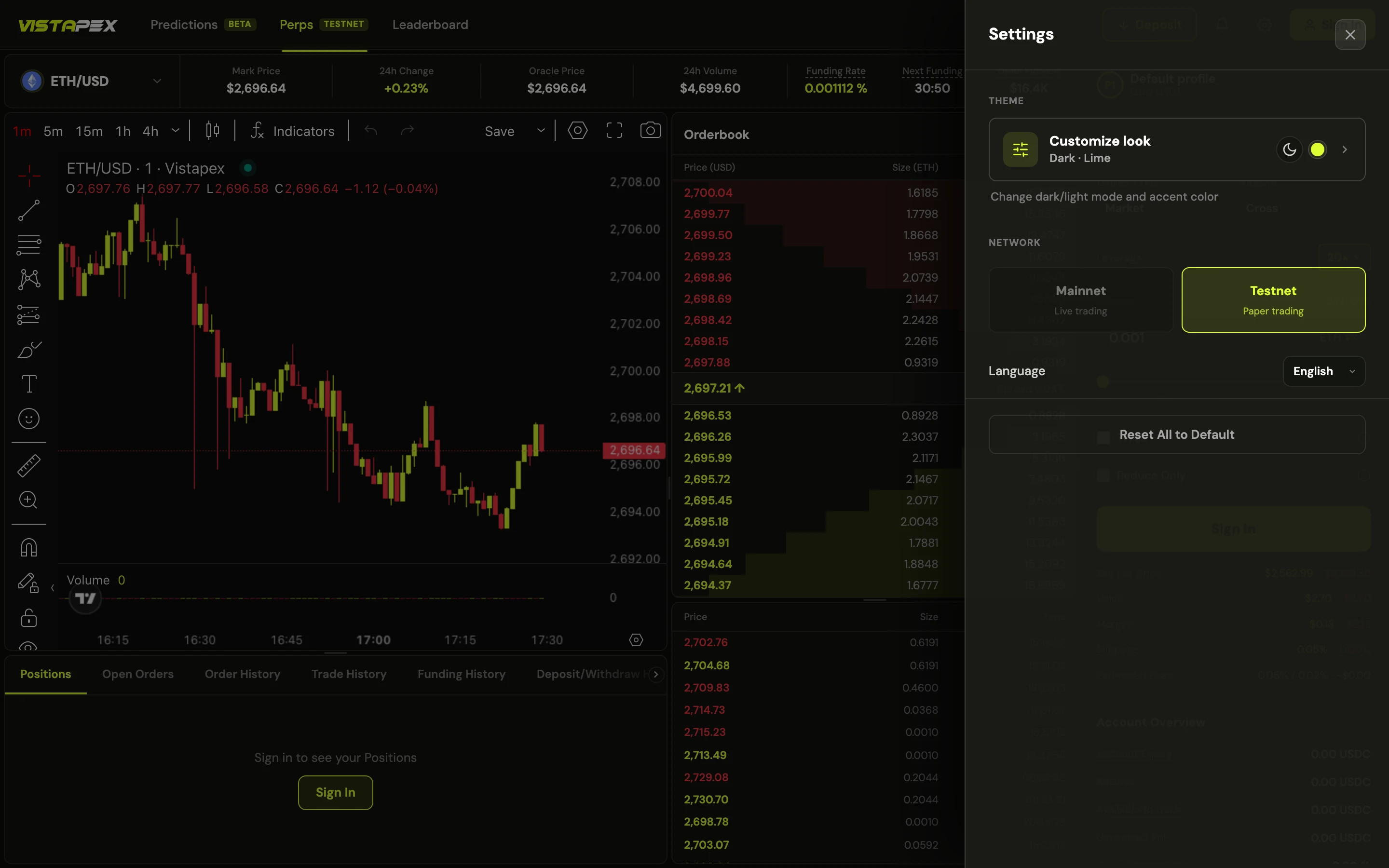
Letting every trader tune the screen to their own eyes
Appearance, buy and sell position, colour mode, accent, contrast, font size, corner radius, spacing and notifications.
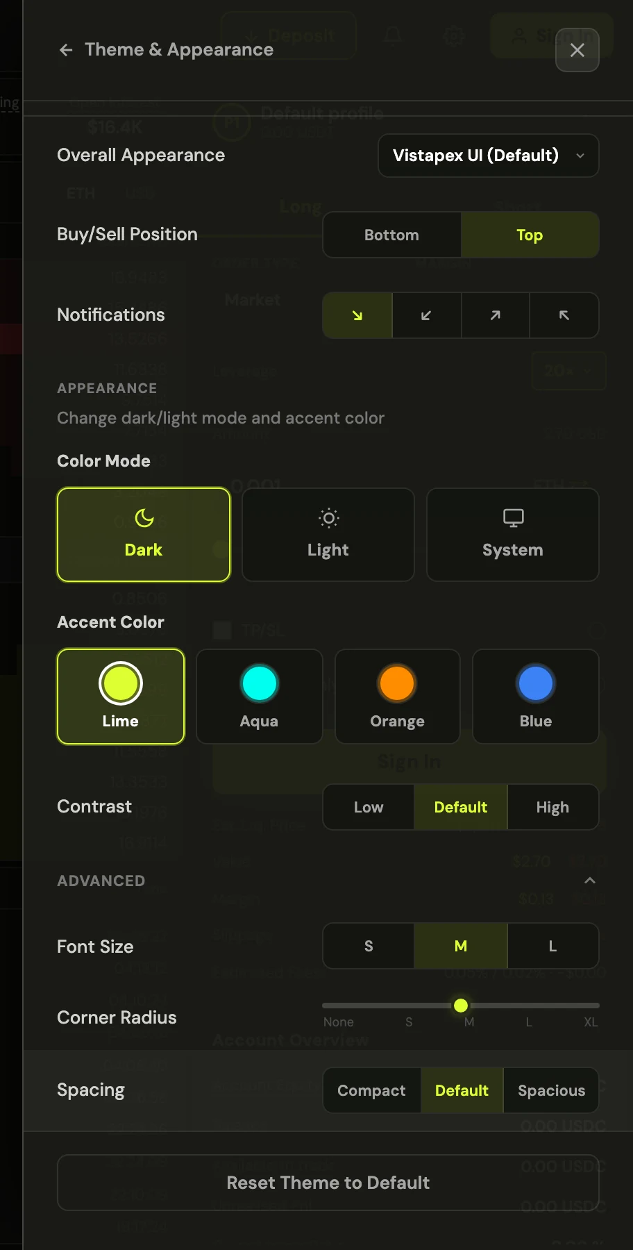
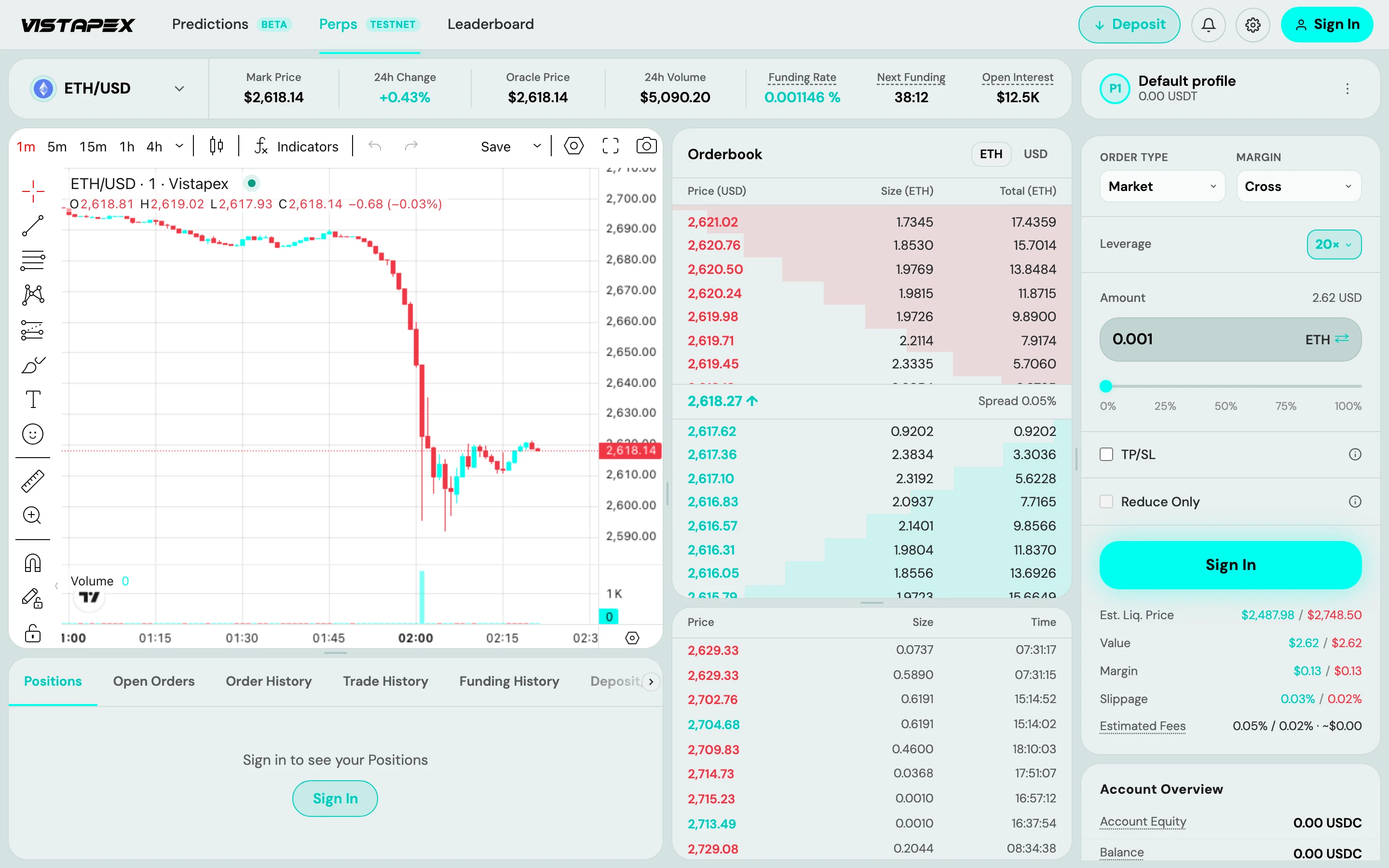
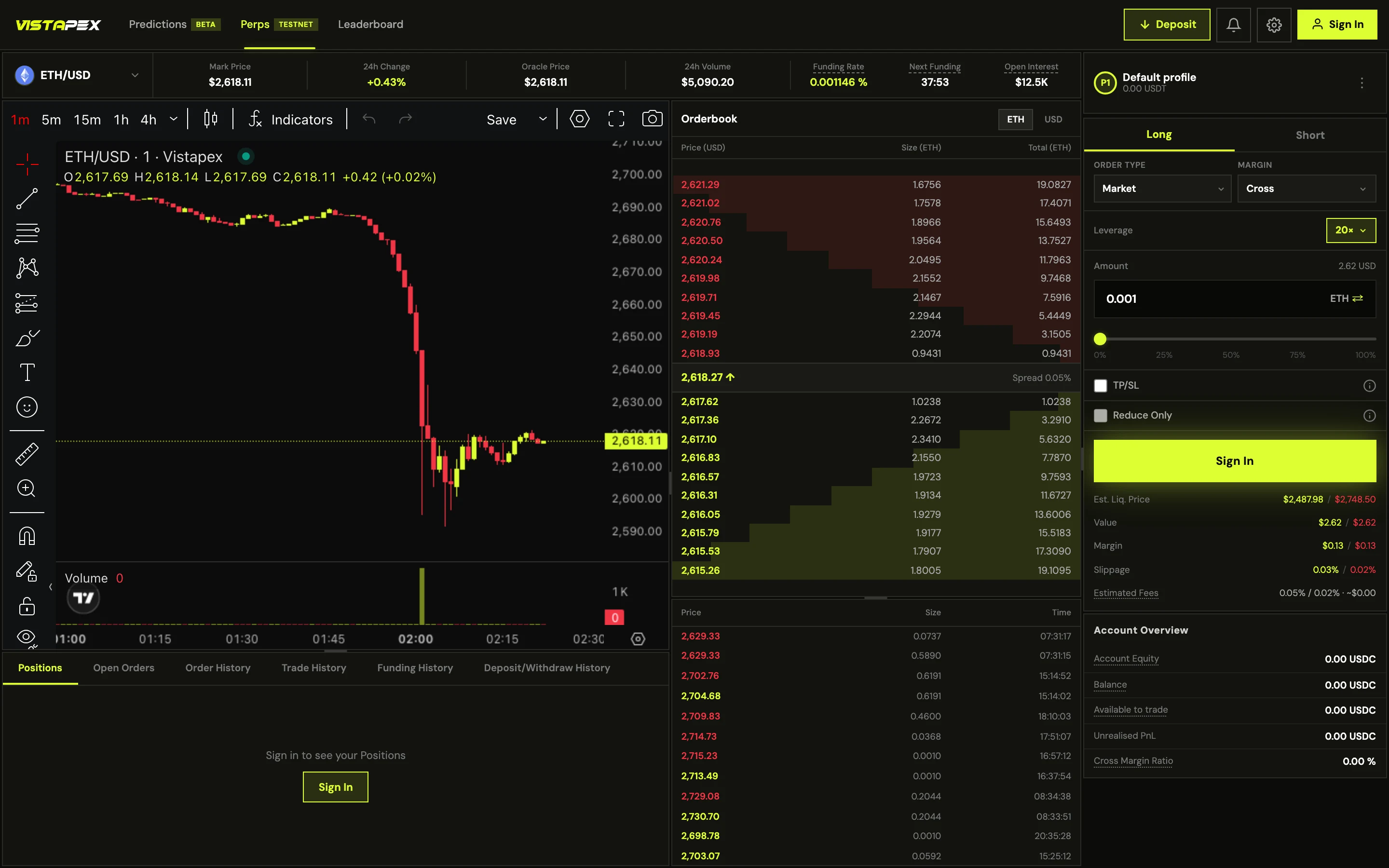
Fencing the freedom, so every setup still looks right
One screen, two traders: light, high contrast, large and round for one; dark, dense and square for the other. Fixed scales keep everything between them deliberate.
Adding an Upbit layout, so traders start on familiar ground
Traders spend most of their time on other exchanges. One setting turns the screen into the layout they already know: square, glued inputs and Upbit’s own colours.
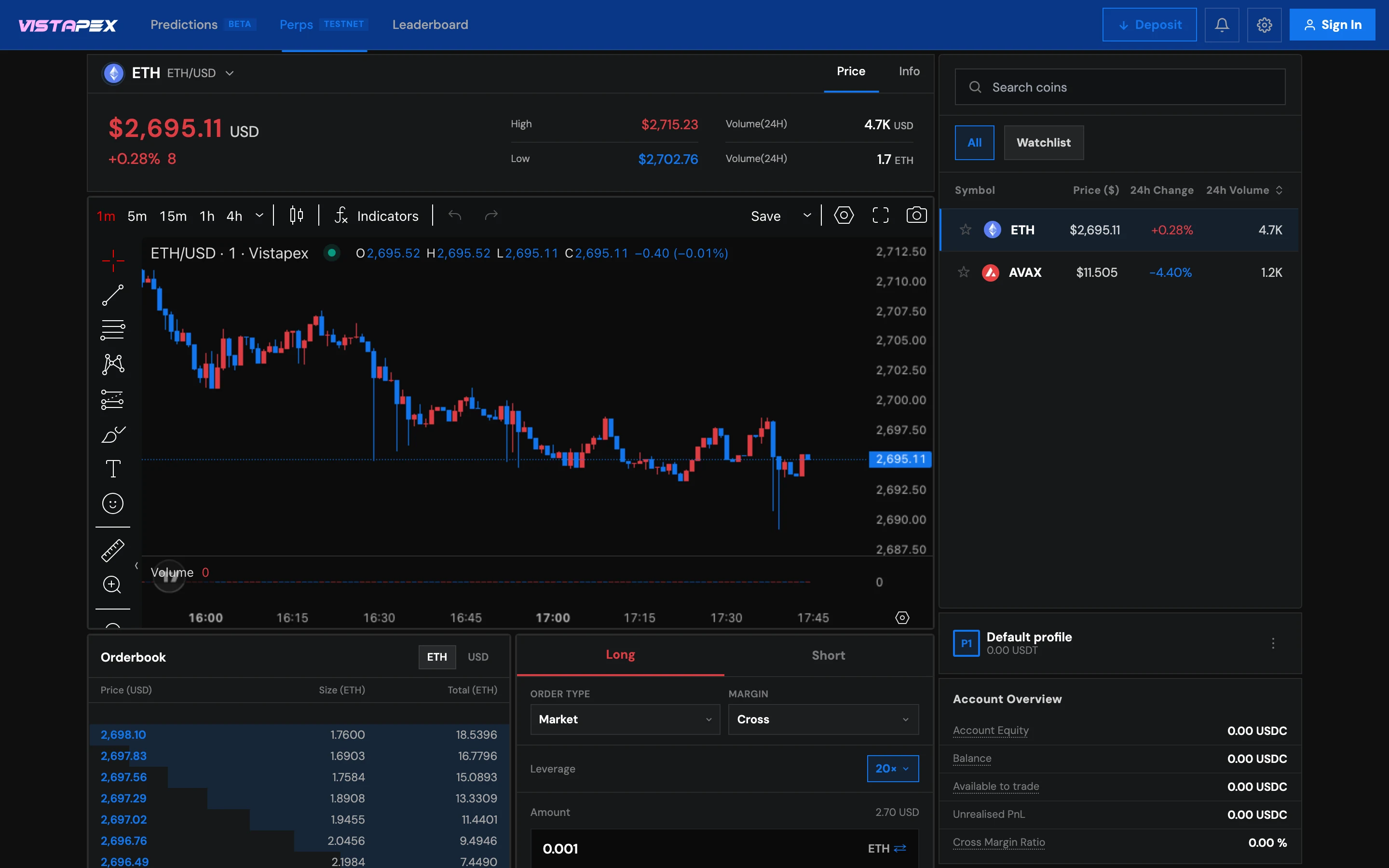
Designing the parts every trade passes through
Where a trader reads the market, places the trade and watches it.
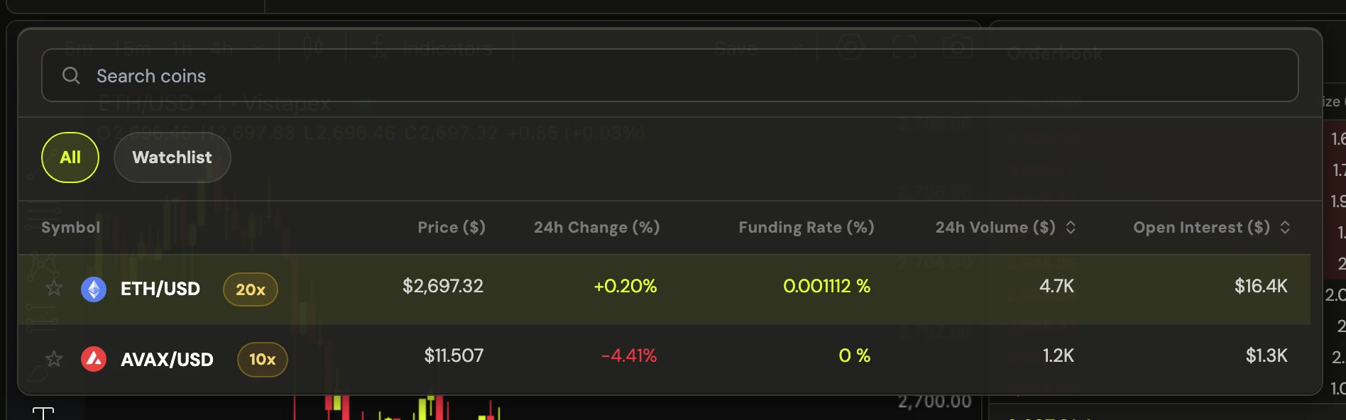
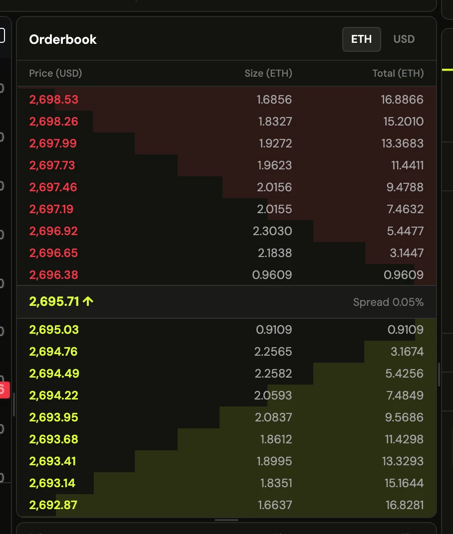
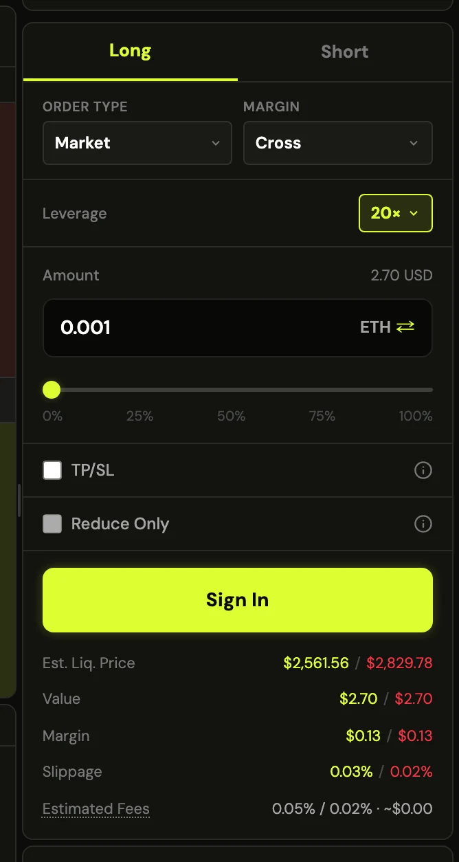
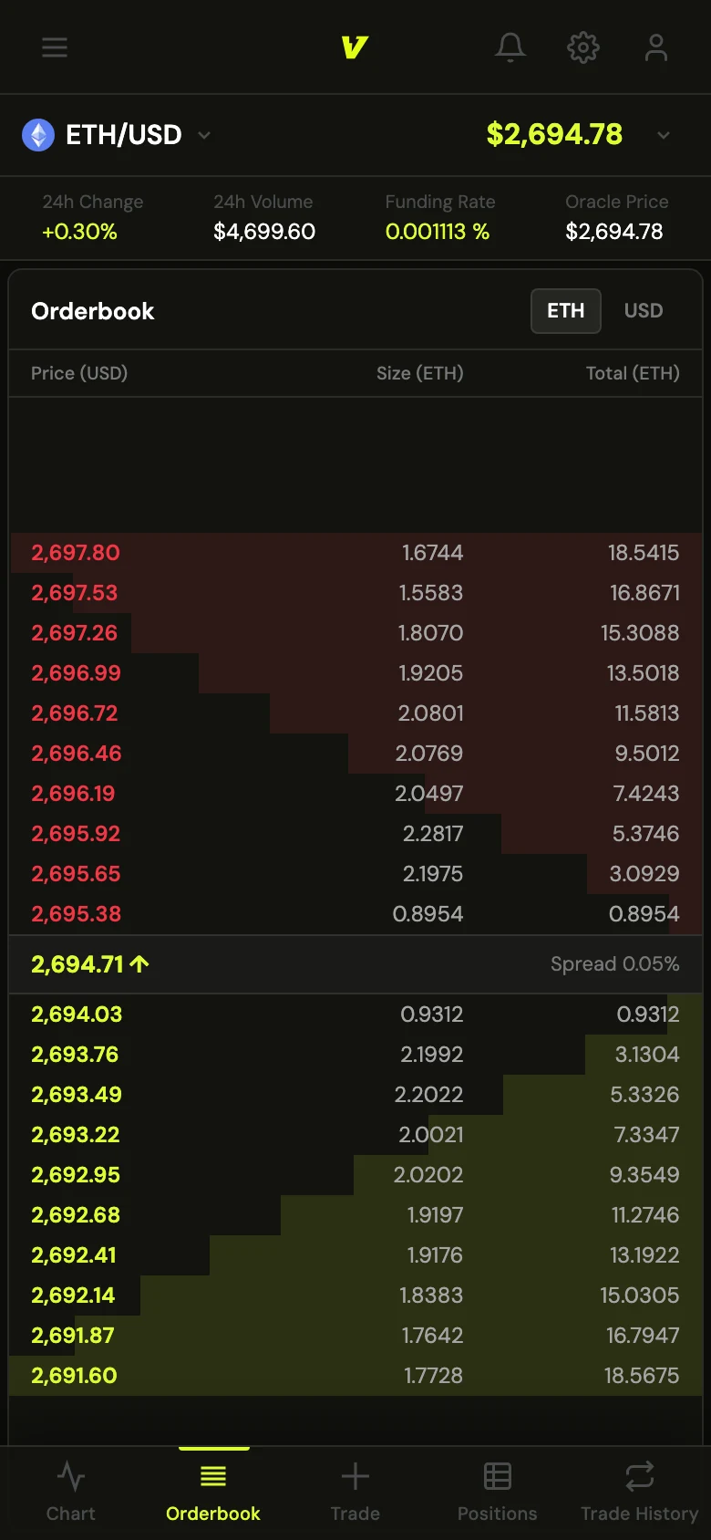
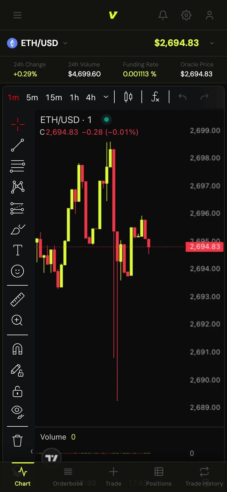
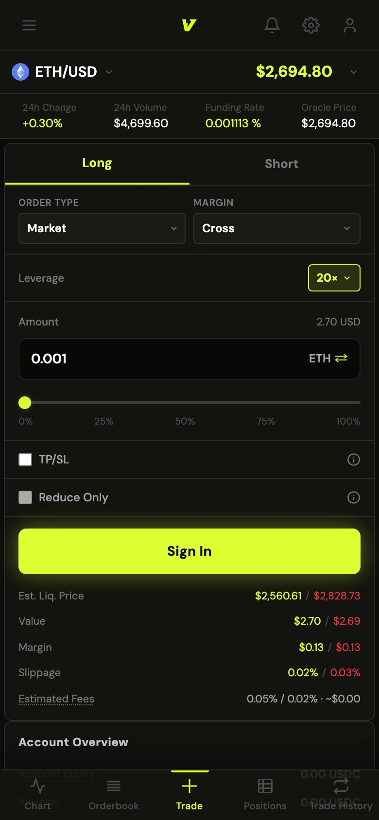
Fitting everything the desktop shows onto a phone
Nothing was cut for mobile. The same data as the desktop screen, rearranged for a thumb.
519
people joined the waitlist before launch
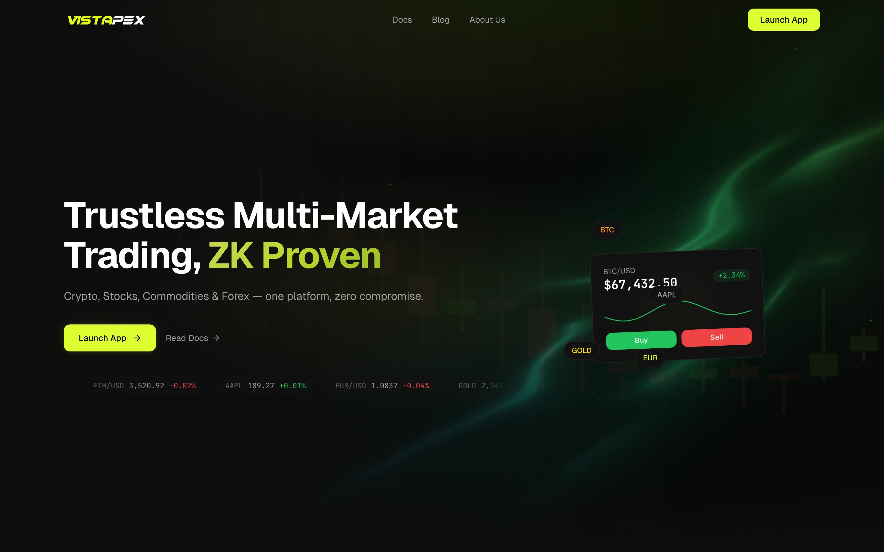
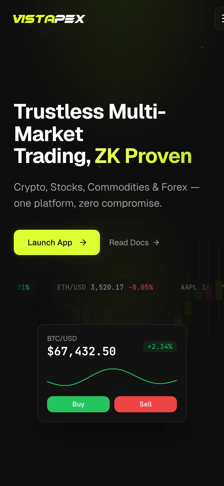
On the waitlist site I designed and kept improving from session recordings.

Building the front end myself, because every setting multiplies the screens
No handoff file could cover every combination. I built it in Claude Code; the architecture and the bounds on the controls were mine.
$1.63B
traded in the first two weeks after public launch
Across 142,892 trades from more than 1,700 wallets, all through the screen I designed and shipped.
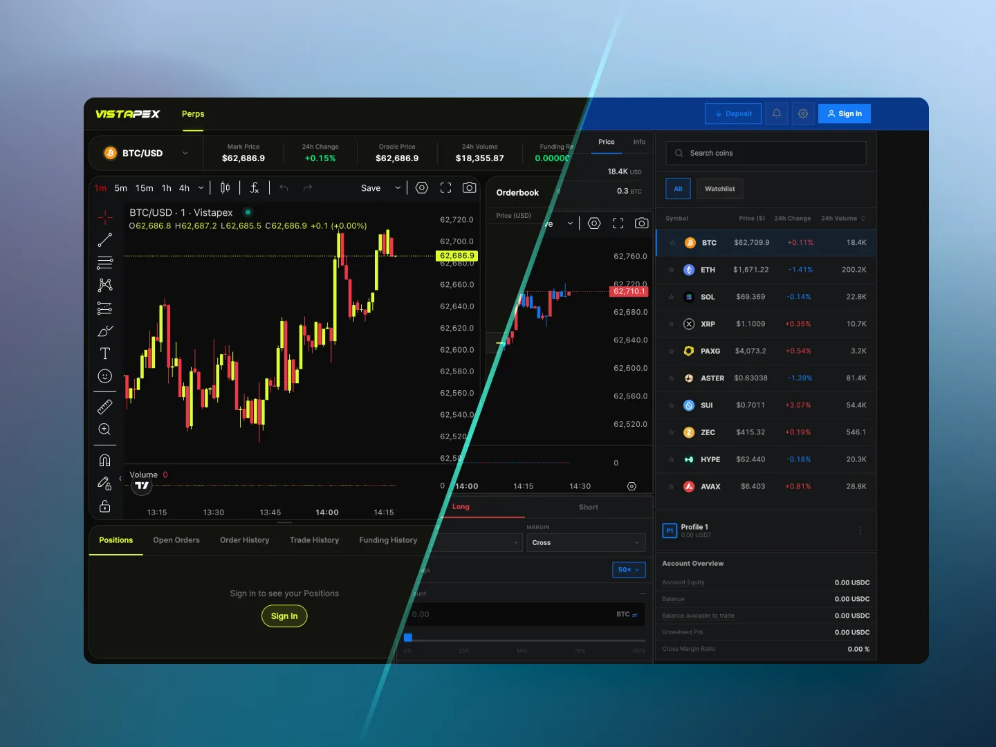
Drawing one mark, where the letter and the bolt are one shape
An angular V with a lightning notch cut from its stem. Four masters, each tied to the ground it sits on.




Keeping lime for the things you can press
One signal colour, so a trader’s eye goes to the action, not the decoration.
Carrying the mark into the product, with its clear space intact
The lockup sits in the header, its clear space measured off the notch in the mark.
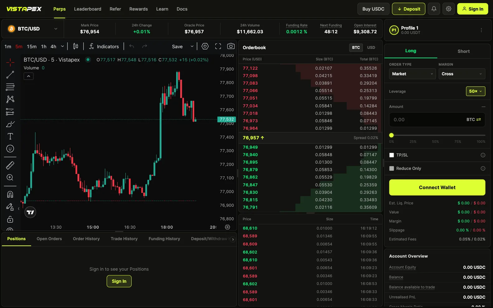
There was never one right screen
Beginners chose bigger text and spacing. Experts packed it dense. The split followed the two kinds of trader exactly.