Designing a coding app kids come back to, and parents trust
Show a nine year old a real code editor and they leave. My job was to make them want to return tomorrow.
- Role
- Product design and content
- Company
- GUVI
- Designed for
- Kids and their parents
- Reach
- About 600 real kids
Designing a daily loop, so coming back is the default
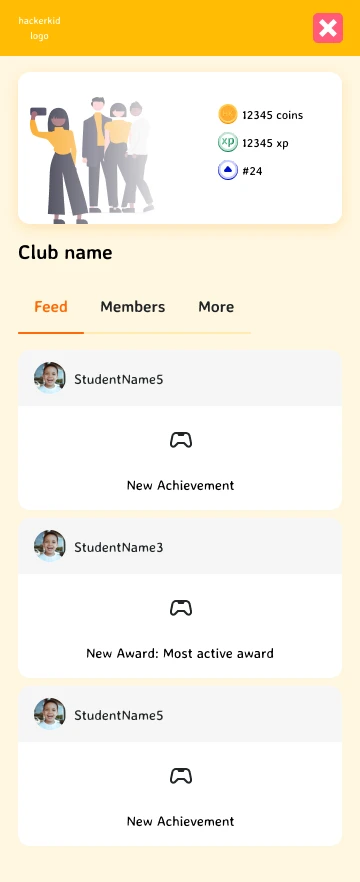
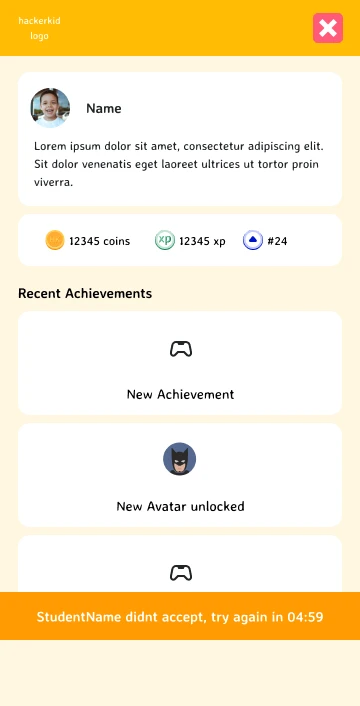
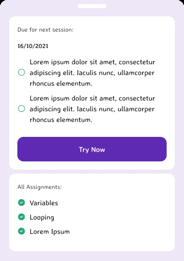
See where you stand, finish the work, earn the streak, see the club move. Every step ends with a reason for the next.
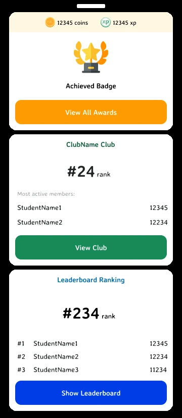
- MeMy profileCoins, XP and rank, the first thing a kid sees.
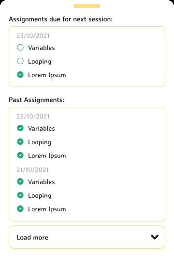
- DoThe assignmentDue before the next session.
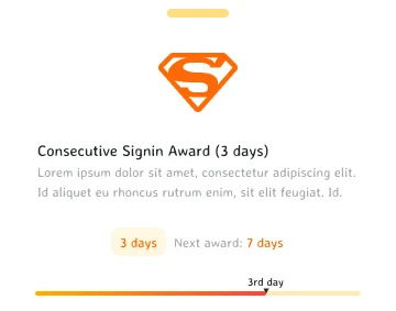
- EarnThe streakThree days, and the next award in sight.
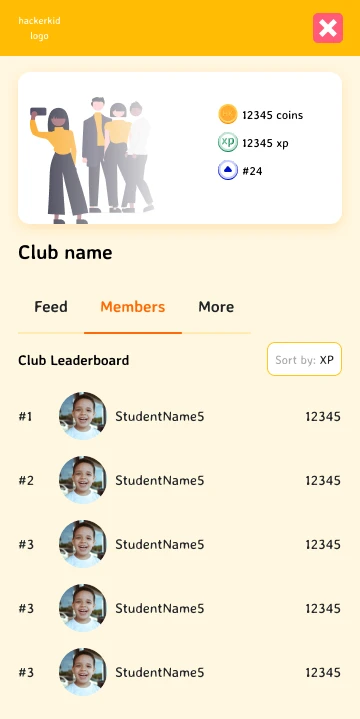
- BelongThe clubFriends, ranked, one tap away.
Rewarding every right step, because coding is full of small failures
A kid feels slow progress as boredom. So a streak shows how far they are and how close the next award is.
Borrowing what already keeps kids hooked, following Jakob’s law
Patterns from Duolingo, Khan Academy Kids and Scratch, adapted to coding without turning learning into a slot machine.
Answering doubts inside the club, so one reply helps every kid
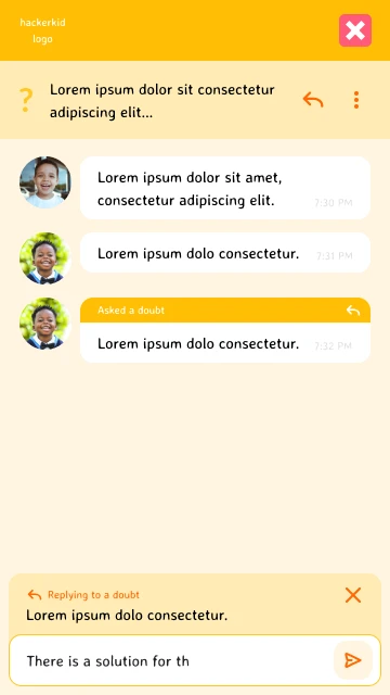
A doubt asked in the club chat is answered where the rest of the club can see it, and learn from it too.
Giving the parent a calmer voice, because the phone is theirs
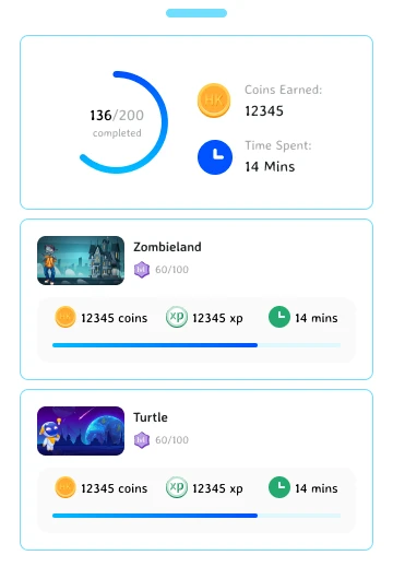
The screen time belongs to the parent. Their view of the same work is quieter than the bright one built for the kid.
600
real kids used the platform
With parents who stayed bought in.
Showing parents what their kid made, so pride brings the kid back
Kids make something, parents show it off and encourage the next one. A view of progress turned monitoring into trust.
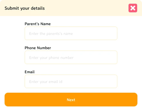
Asking the parent first at signup, because they decide
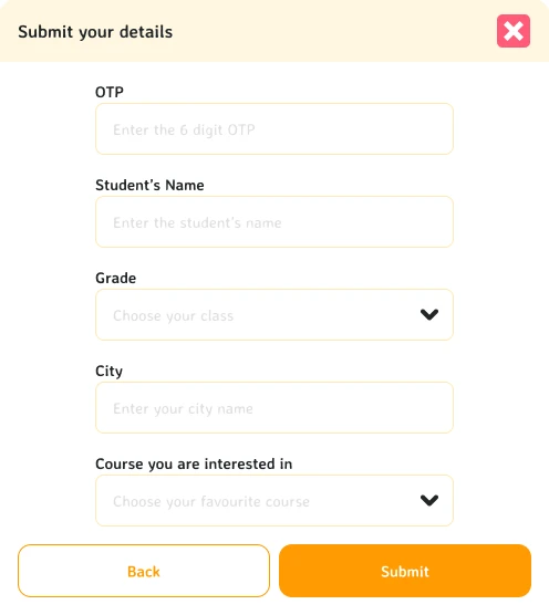
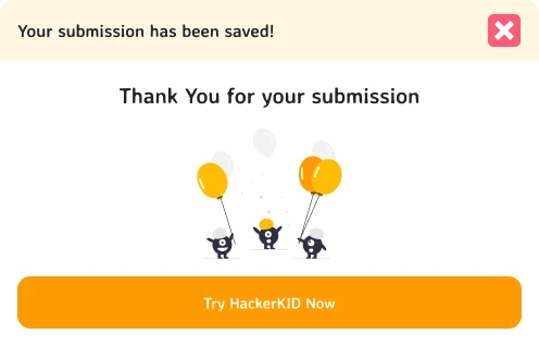
The parent’s details, then the kid’s, then a thank you that points straight at the first lesson.
- Step 1The parentName, phone and email.
- Step 2The kidGrade, city and the course.
- Step 3SavedThen straight into it.
Selling each course by what a kid gets to make
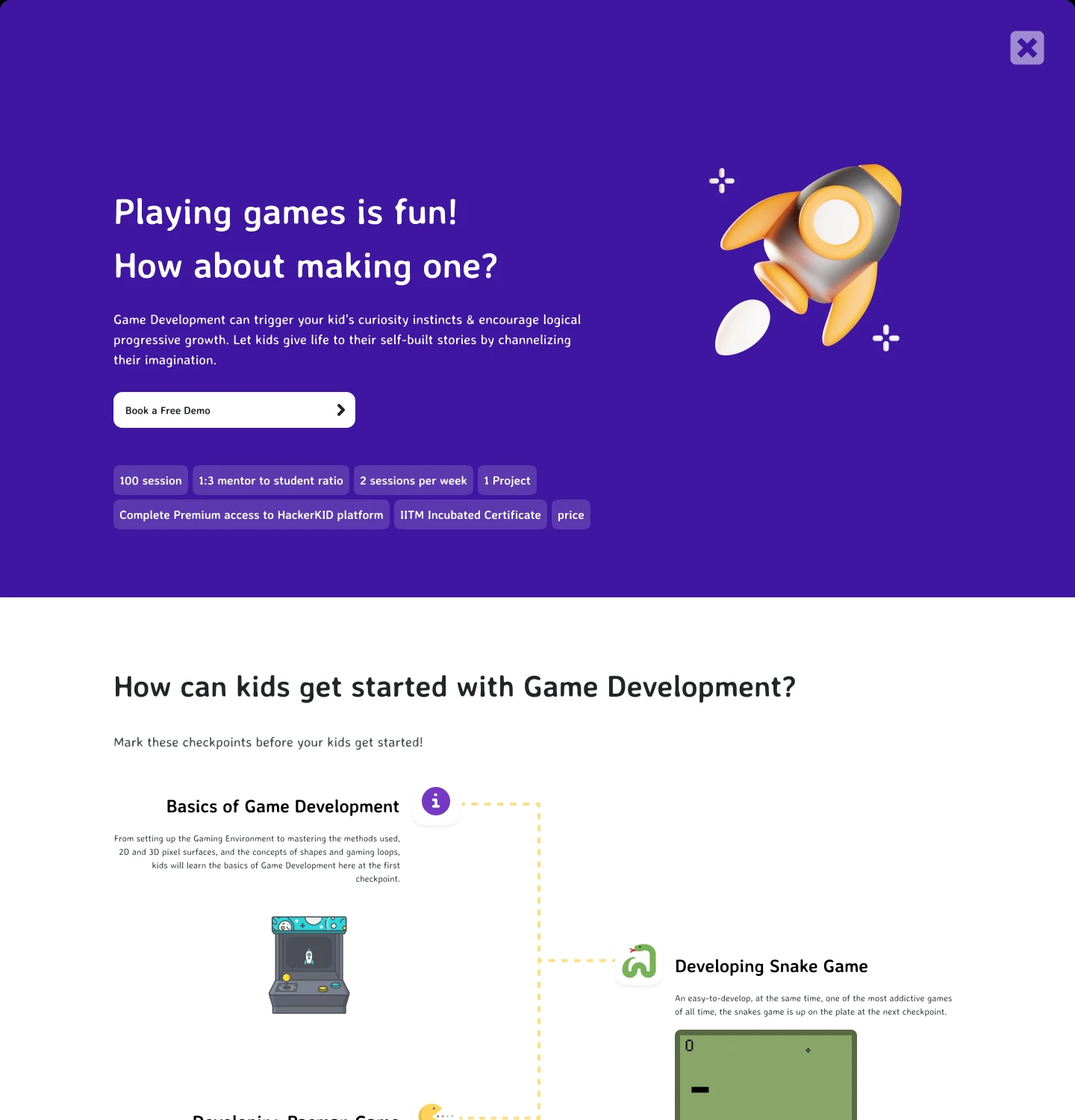
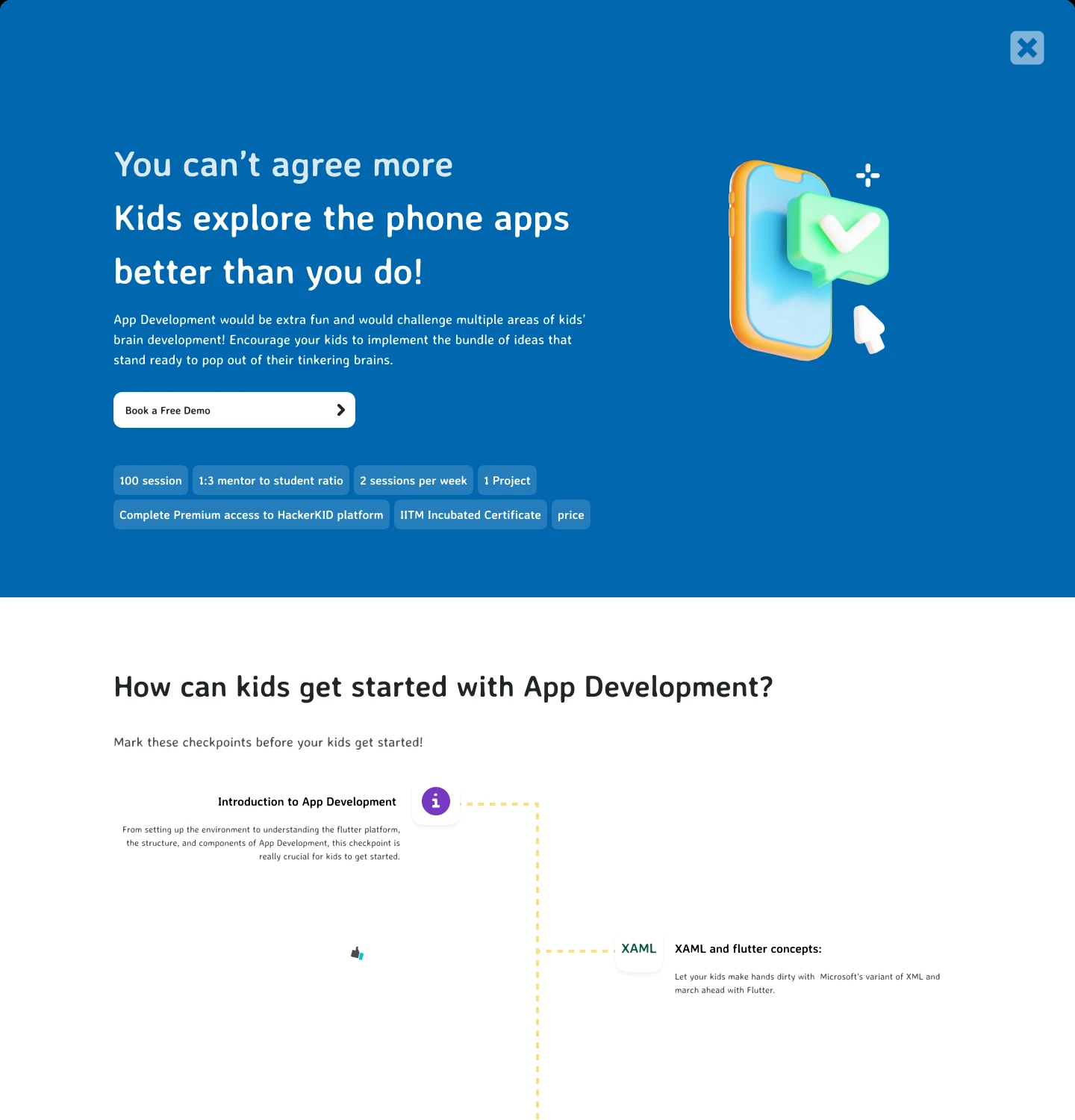
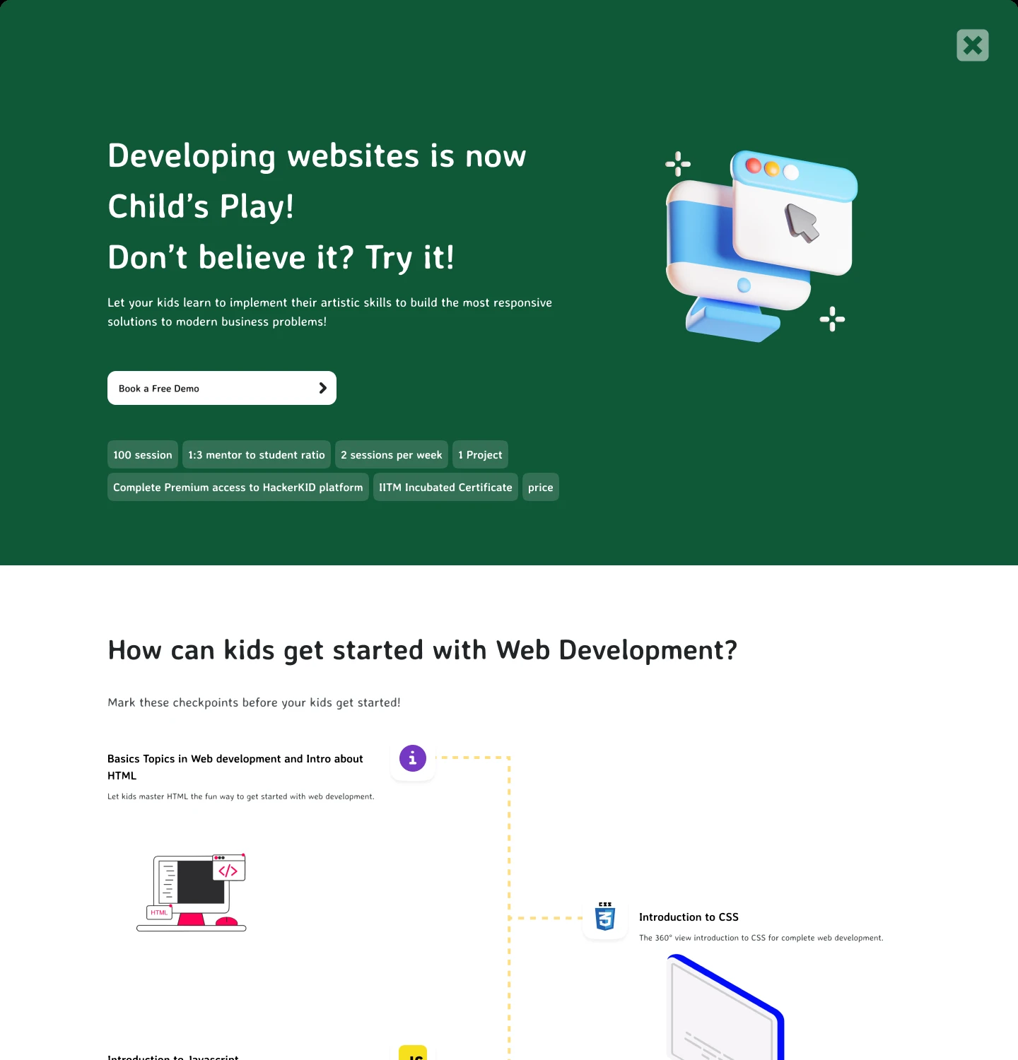
Games, apps, websites and AI, each on its own page, written to the parent and pictured for the kid.
- CourseGames
- CourseApps
- CourseWebsites
- CourseAI
Next time, I would measure the confetti
I would track where rewards stop motivating learning and start motivating collecting.