Brand · logo & identity
Vistapex
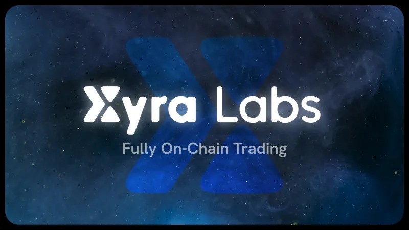
XyraLabs · 2026
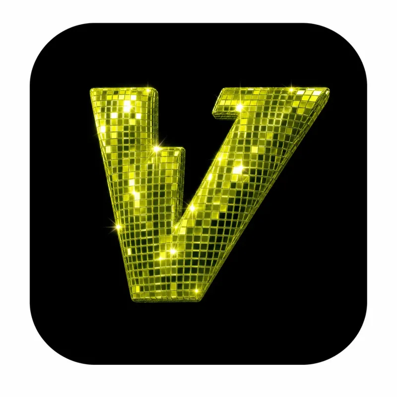
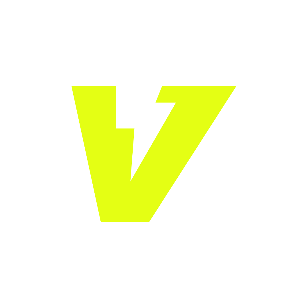
One mark, drawn once: an angular V with a lightning notch cut out of its left stem, so the letter and the bolt are the same shape rather than a letter with a bolt next to it. Everything below is a rule about where that shape may go, and the rules are strict because it has nothing to fall back on — no outline, no gradient, no second weight. On a ground that fights it, the silhouette is all there is.

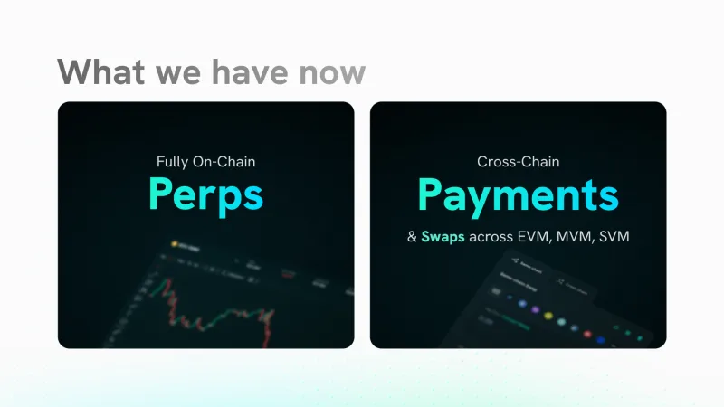
Trade · perps & swap · Aptos
01 Variants
Four masters cover every surface, and each is tied to a ground rather than to a taste. Lime is the identity. White is the reverse, for photography, video and any ground busy enough that lime stops reading as an accent. Black is the one-ink positive, and it does double duty — on paper and on the accent itself. Olive is what the lime has to become on white: same hue, contrast restored, because #E4FF14 on paper is a highlighter stain, not a logo.


02 Clear space
Reserve the height of the mark's notch on every side. The mark never touches type, another mark, or the edge of its container.
X = the height of the notch
Measure the lightning notch cut into the mark's left stem; that is
the unit. Pad every side by 1X. More is always fine —
less starts eating the silhouette, which is the only thing carrying the identity at small
sizes.
- Minimum clear space
- 1 × notch height
- Recommended on hero
- 2 × notch height
- Minimum size · digital
- 24 px
- Minimum size · print
- 12 mm
03 Do & don't
Flat, single-weight, always at 0°. Two placements that work, and the two failures worth showing rather than listing — both of them are ways of destroying the silhouette while leaving the file untouched.
-
Do
Lime on
#0a0a0bor darker, full clear space on all sides. This is the hero placement and the one the mark was drawn for. -
Do
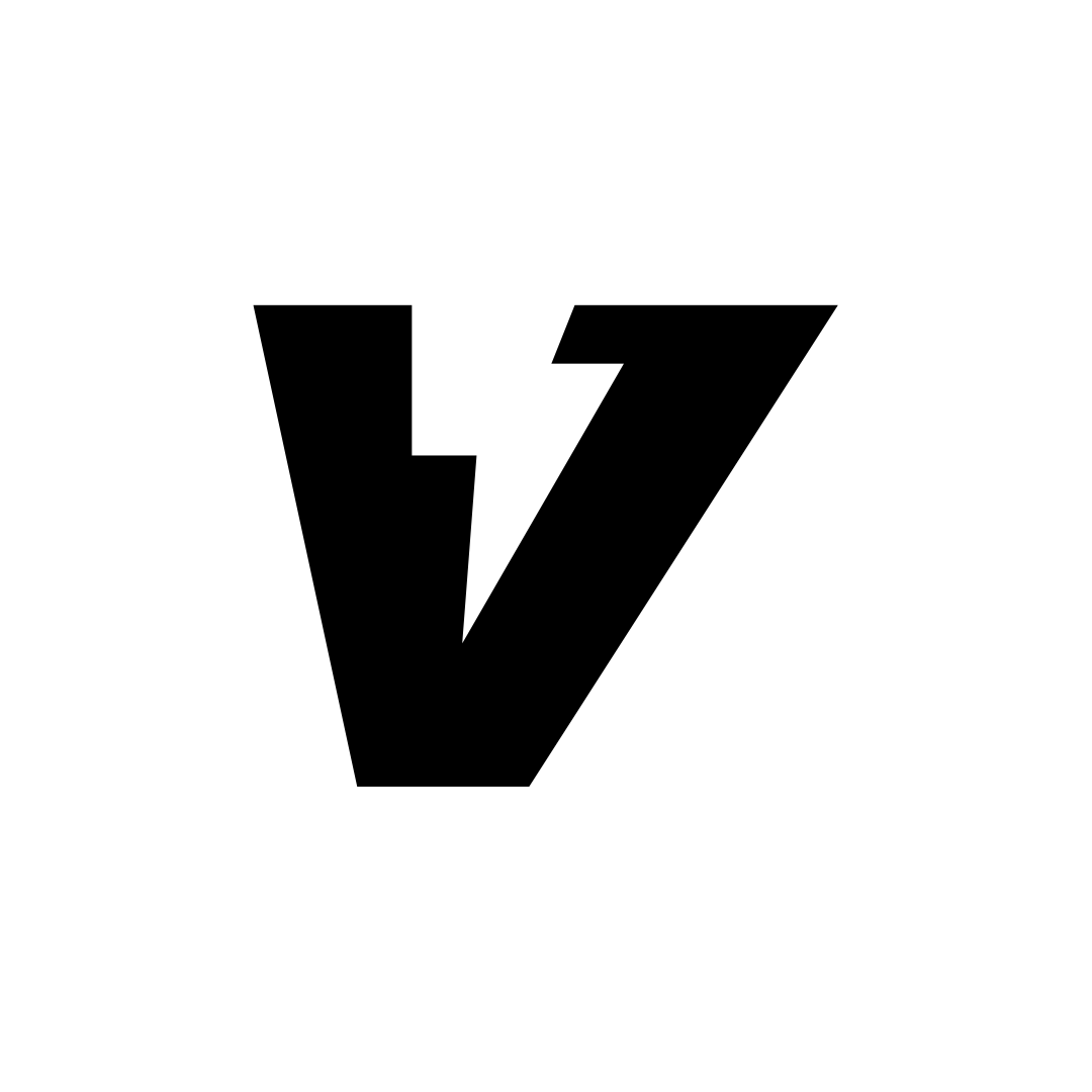 Black on
 #f4f4f4or lighter. Print, light-mode favicons, and anything one-colour — stamps, invoices, embroidery. -
Don't
Never put the lime mark on green, olive or chartreuse. The
hue is close enough that the silhouette stops separating from the ground — and the
silhouette is the whole mark.
-
Don't
Never rotate, skew, outline or recolour it, and never add a
gradient, a stroke or a drop shadow. Rotated, the bolt reads as a checkmark.
04 Applications
Four placements at the four heights that actually ship, ending on the one surface the system does not own: a press page or an exchange listing, where the lockup arrives on somebody else's white. The lockup here is the shipped wordmark file, not the mark set beside live type — the name is drawn in Robot Rocket and outlined into the SVG, so there is no webfont to load and no lockup to re-assemble by hand.

05 In product
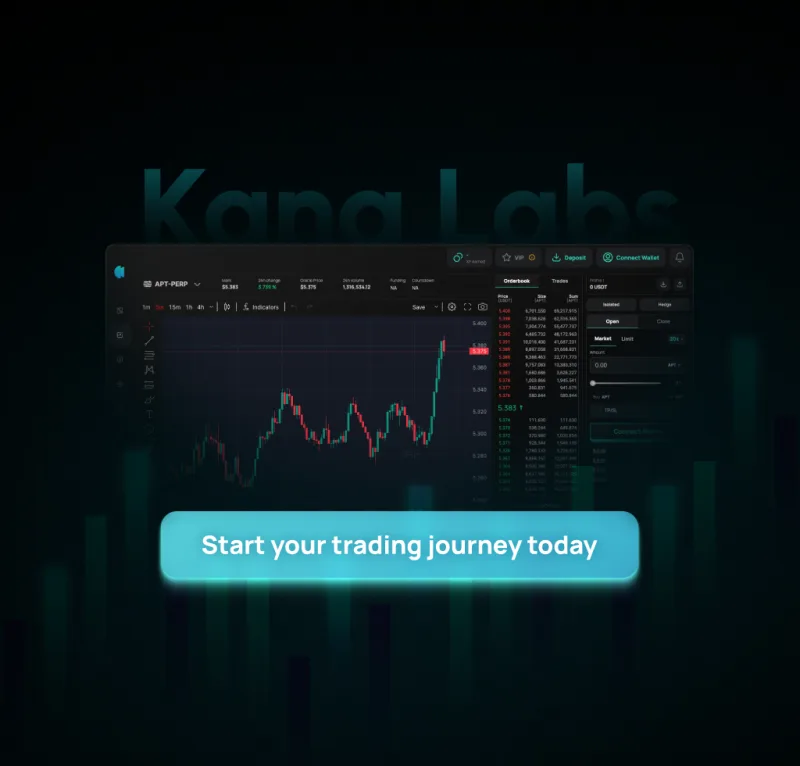
The perps terminal, shipped. The lockup sits at 28px in the header on
--bg-base with its clear space intact, and the mark appears
exactly once on the whole screen. Below it lime is spent only on interactive primaries — the
active side, the leverage chip, one call to action per panel — which is why a dense grid of
figures still has an obvious next step in it.
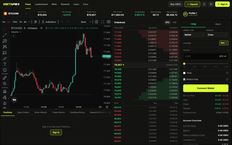
vistapex.xyz · perps terminal, 2026
Every mark above is the shipped SVG, on a ground the browser computes from
the system's own tokens.css — real CSS, not a screenshot of a
brand book.