De-slopping a money app for AI agents, from audit to brand
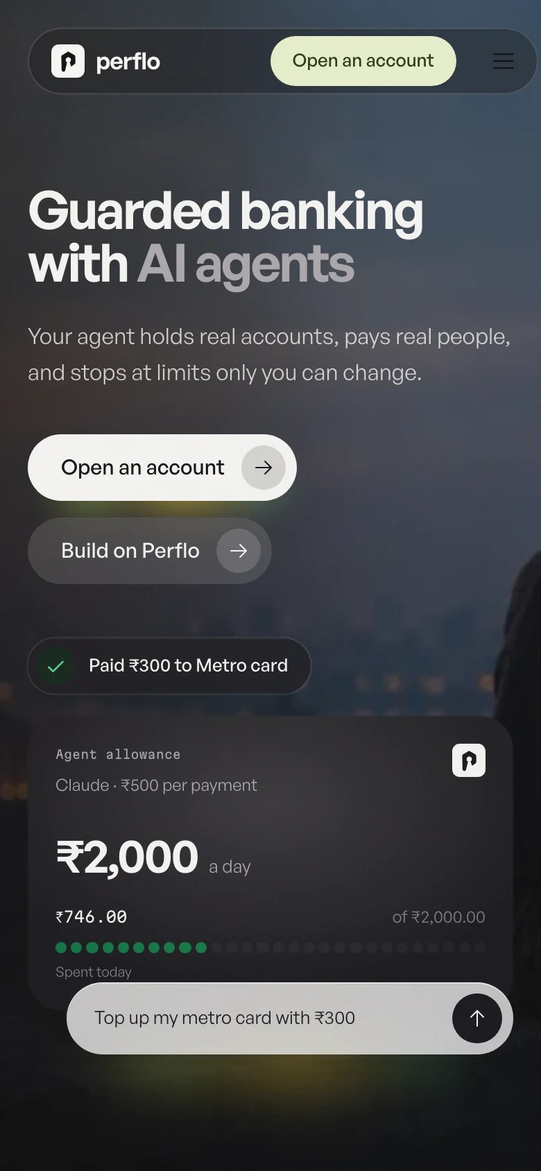
Perflo lets an AI agent spend real money. Its live product looked generated. I audited it, then rebuilt brand, site and app.

- Role
- Audit, brand, website and app
- Year
- 2026
- Audit
- 46 annotated screens
- Perflo 2
- Three days, forty commits
Finding where people get lost by using the app with real money
46 screens, small real payments. Every finding failed the Trunk Test: you could not tell where you were, or where things lived.
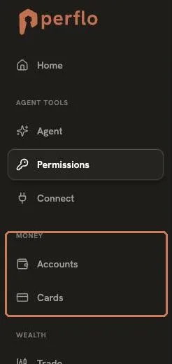
- Four navigations. A sidebar, a profile menu and two tab bars that overlap.
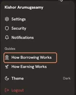
- Seven names for one balance. Total balance, net worth, available to spend and four more.
- Two editors for one policy. Permissions and Spending both changed the same limits.
- Fifteen rules across four tabs. Every limit you could set, scattered.
- Connect and Connect Apps. Two pages, two names, nearly one job.
De-slopping the surface, one generated tell at a time
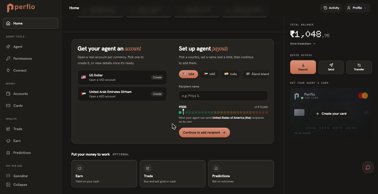
The structure lost people. The surface lost trust: the patterns generated apps reach for, on a product that holds real money.
- Italic serif accent words. A decorative tic in a product about money.
- A pixel font for the balance. The most important number, in the least legible face.
- Uppercase, letter spaced labels. Small type shouting on every card.
- Glowing terracotta buttons. Three on one screen, so none of them leads.
- Identical icon cards. Same shape, same weight, nothing to choose between.
Simplifying navigation so there's less to choose from, following Hick's law
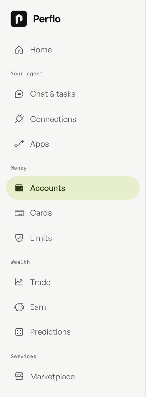
Four menus offered overlapping routes to the same places. One sidebar, grouped by the job you came to do, gives every page exactly one home.


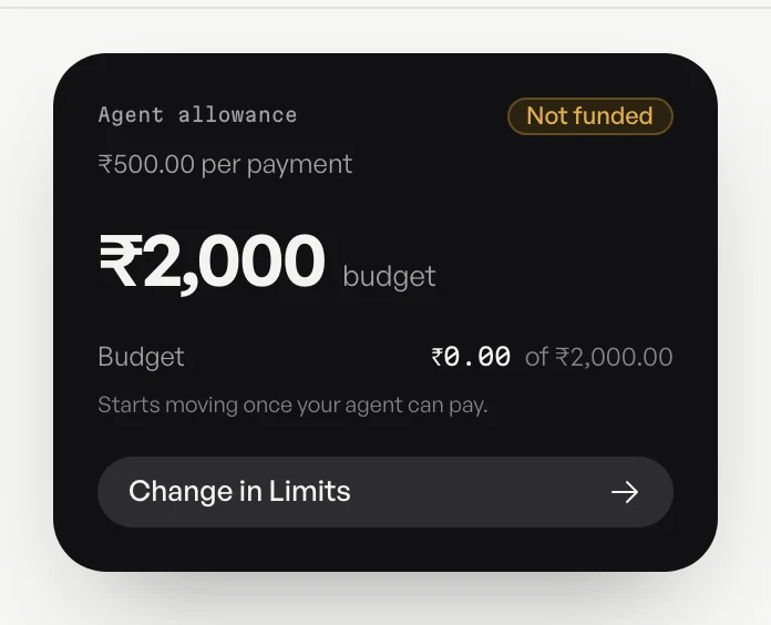
Naming one balance once, so nobody has to recall which is which
Seven labels for one balance broke consistency and forced recall over recognition. Now it has one name, on one card, everywhere.






Borrowing patterns people already trust, following Jakob's law
People spend most of their time in other apps. I took one proven pattern from each of six, and wrote down what to leave behind.
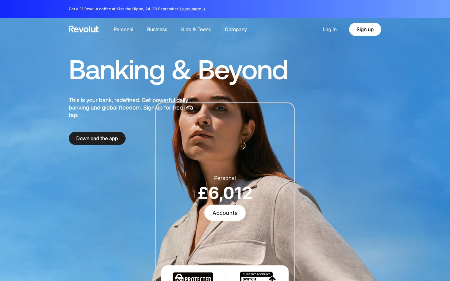
Revolut: real UI over photography. Left its gradient.
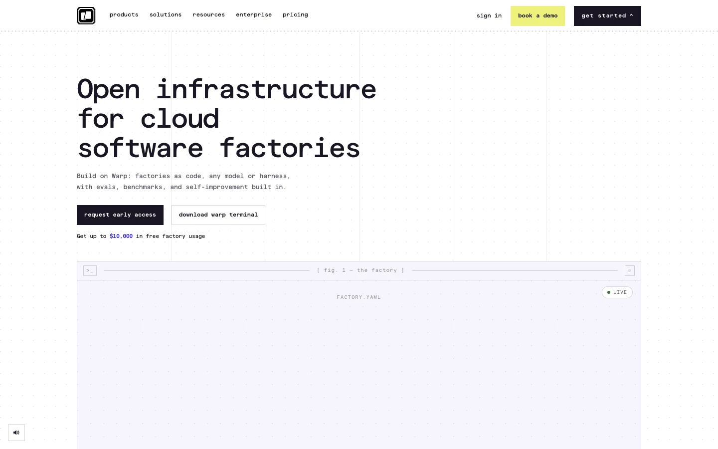
Warp: the mono system voice
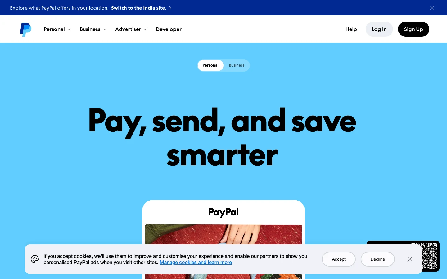
PayPal: the black pill
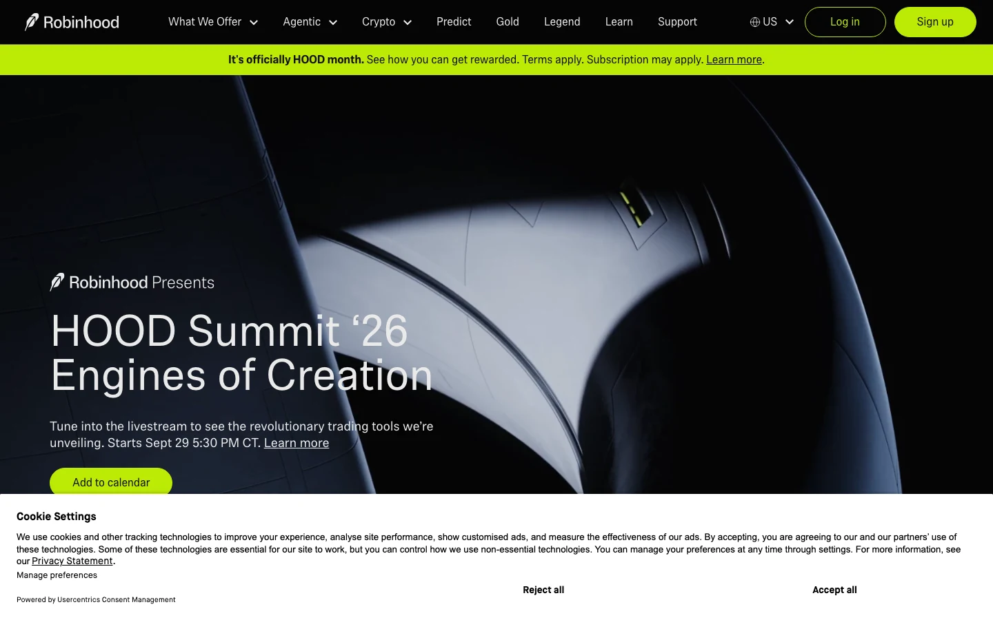
Robinhood: one accent on black
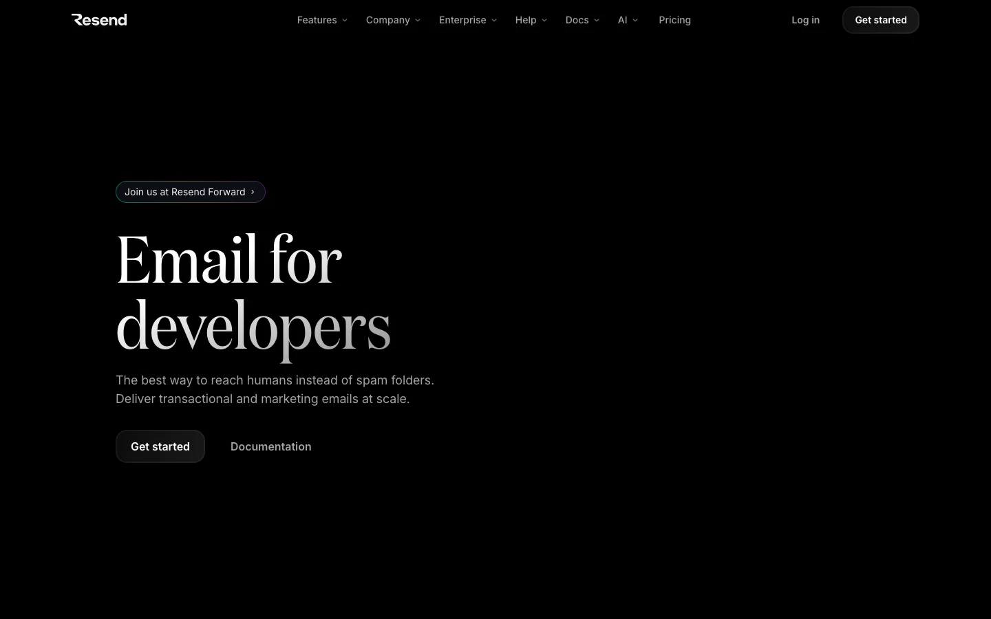
Resend: restraint
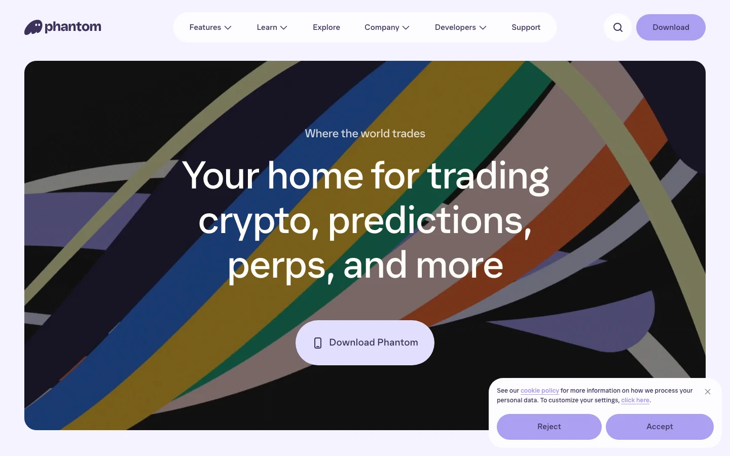
Phantom: an ownable shape
Iterating in rounds, so every decision was tested before it shipped
Each round ran in a lab page beside the real product, then rolled out to every screen from the tokens.
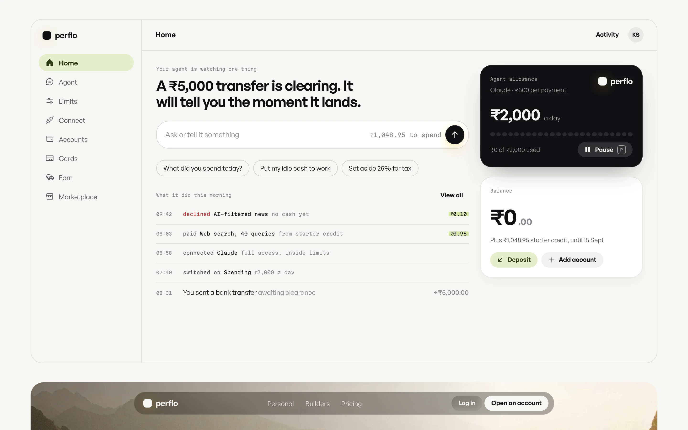
- Round 1How far to leanRevolut softness with Warp’s mono voice.
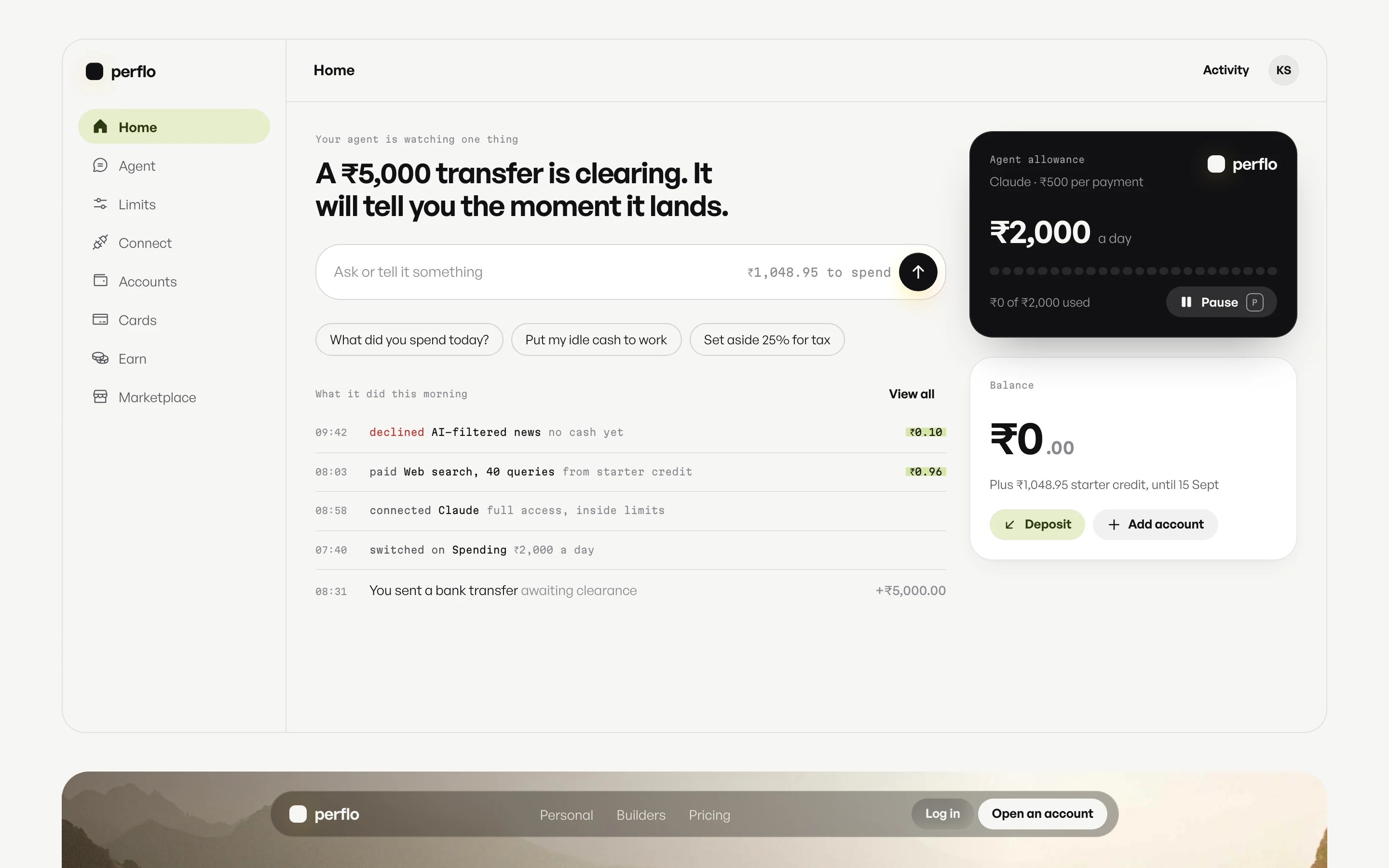
- Round 2The type pairGeneral Sans and Martian Mono.
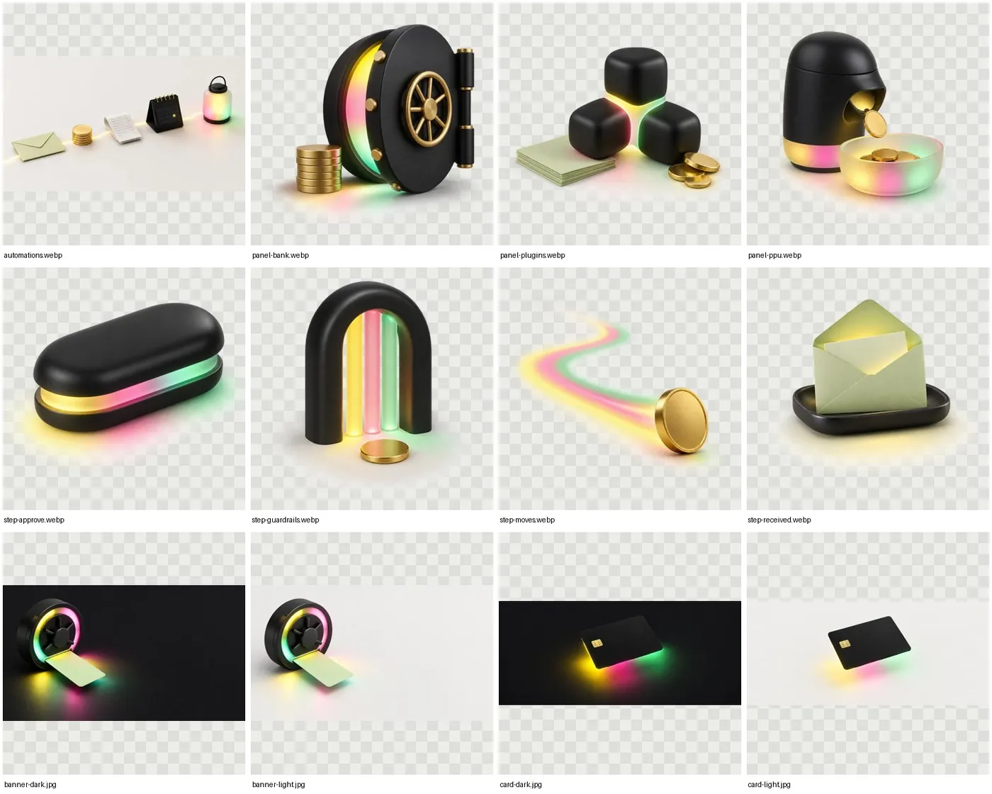
- Round 3The artObjects in ink and frosted glass, and a mascot.
- Round 4The serious passThe mascot hidden, the original mark back.

- Round 5The hero runs the productAn ask is typed, checked and landed.

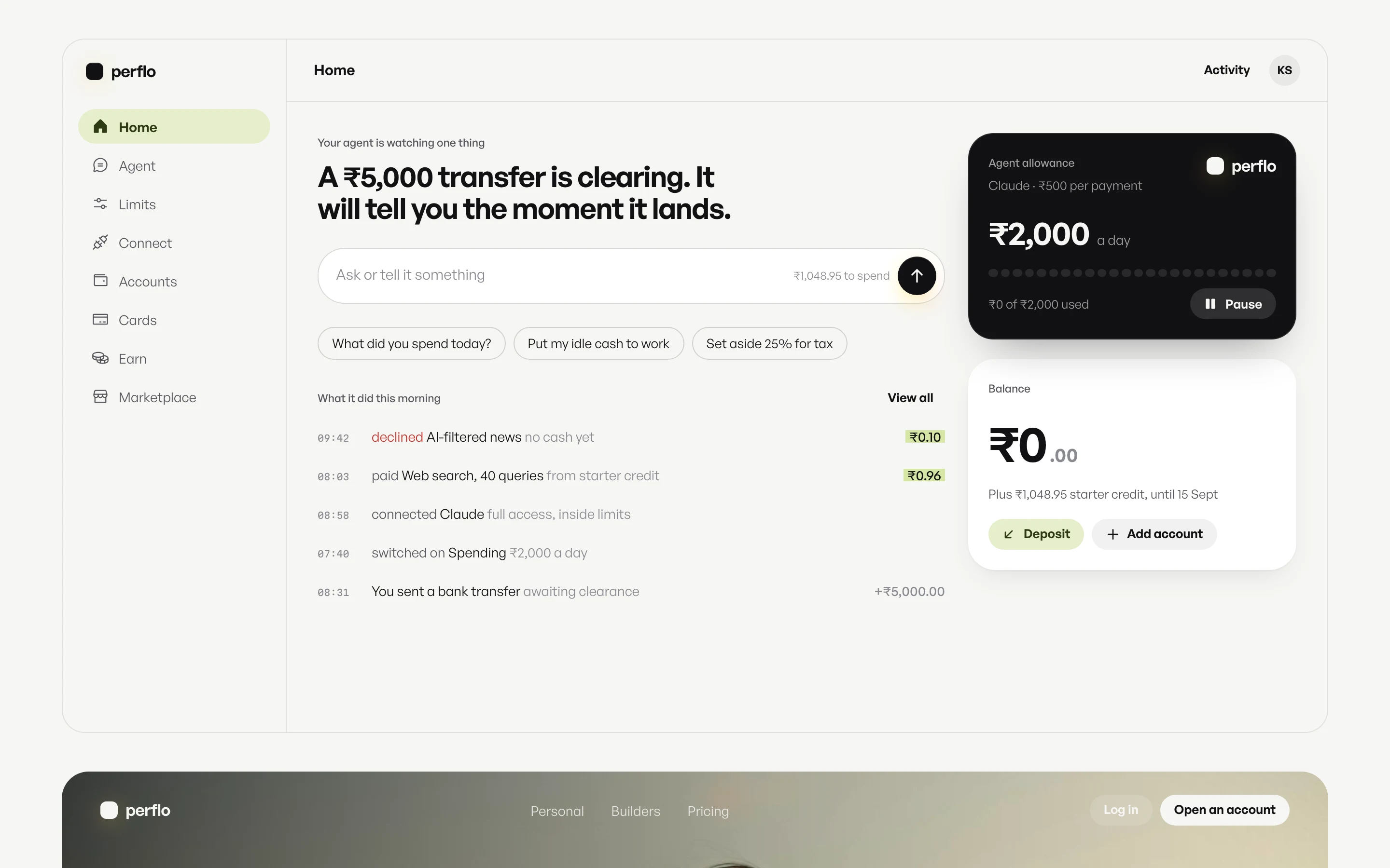
Testing how far to lean between consumer warmth and pro tool precision
Same parts, same screen, three directions. The blend kept consumer softness and gave the system its own voice for receipts and labels.
Reserving one light for the one action that matters on each screen
Light spills from below the primary action and moves only while the agent works, so status is visible without a spinner.
blur 12px · spill 26% · opacity 0.8 · saturation 1.15
Cutting a mascot that made a money app feel less trustworthy
Flo, a firefly whose tail is the glow, was charming as art. Beside a balance it read unserious, so object art took its slots.

Showing the product working, instead of describing it
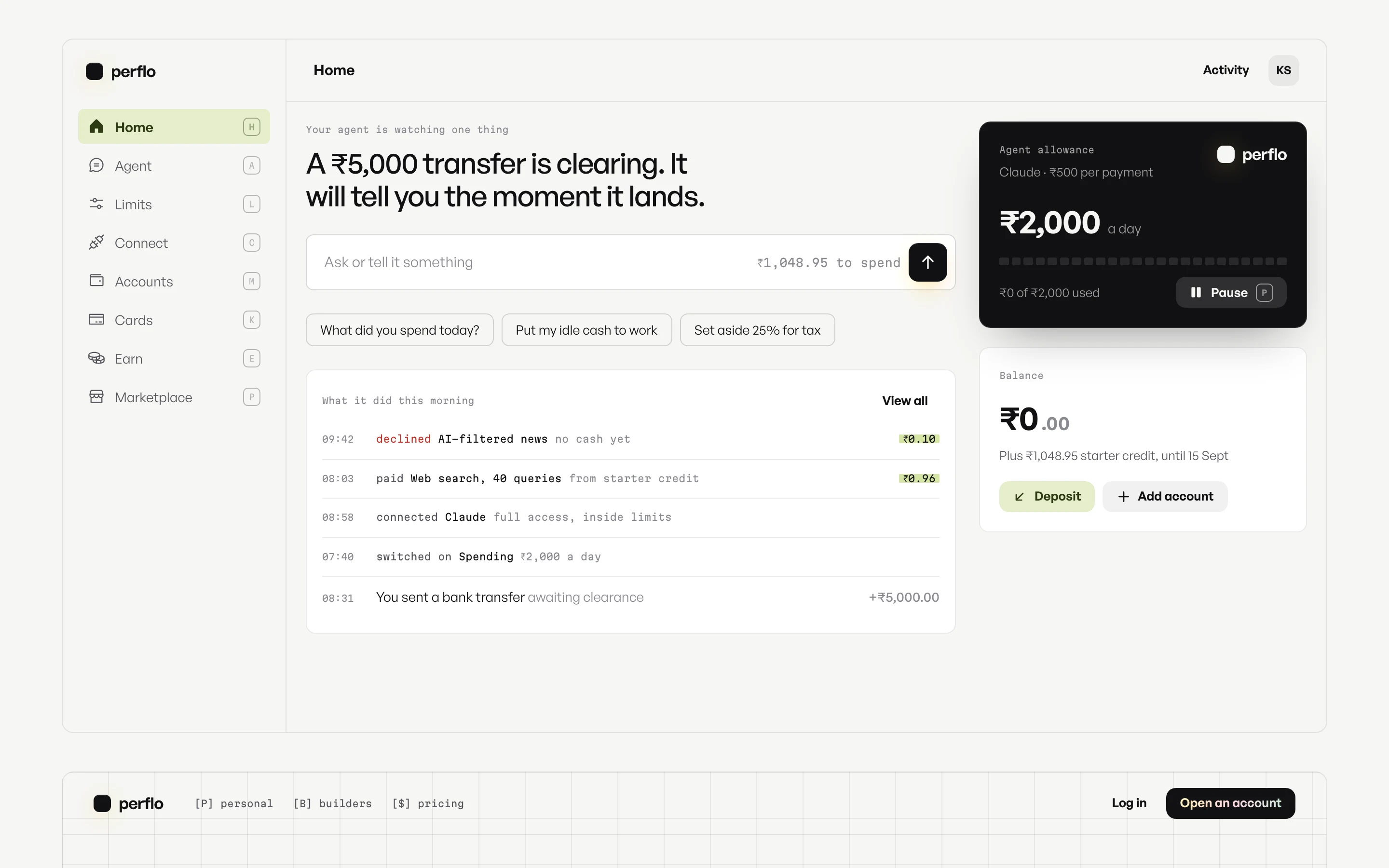
In the hero an ask types into the composer, the agent checks it against the allowance card, and a receipt lands.
Leading with the product, so the first screen explains what it does
The old site opened on a headline and a call button. The new one opens on a real request and its receipt.

Making the agent's spending limit one object you can recognise
The allowance card is the only ink object in the app. Budget, what is used and who issued it, wherever money is at stake.
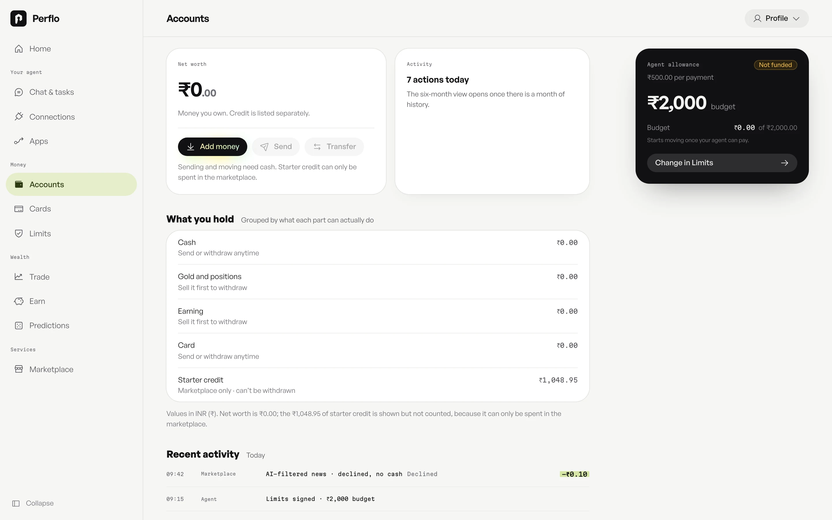
Writing agent actions as receipts you can check at a glance
Mono, with the amount highlighted. You read what your agent did the way you read a bank statement.

Preventing mistakes by making a limit readable while you set it
Fifteen rules on four tabs became one page. The slider and the meter are the same picture, and Save appears only after a change.

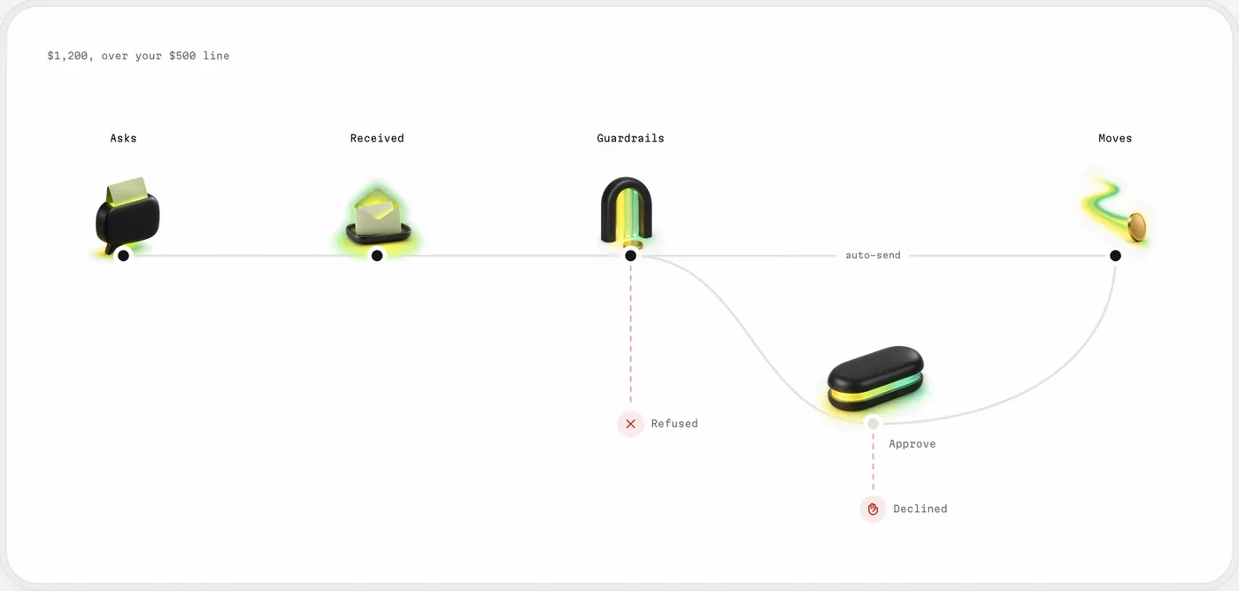
Drawing every payment as a path, so the rules are visible
Straight means it sends itself. A dip means it waits for you. Refused and declined are where it can stop.
18
fixes from an anti-slop design review, shipped the same day
Every route in both themes, at desktop and phone widths, motion on and off. Uppercase eyebrows, a second glow and stray accents all went.
Keeping the original mark, so existing users still recognise it
The original glyph, unchanged in shape, now sits paper on ink. It flips with the theme and never glows.


Giving every colour one job, so the meaning survives the next designer
Each colour has what it means and what it must never do. A token lint enforces it, so taste does not have to.
| Means | Never | |
|---|---|---|
| Ink | The primary key, limits, the allowance card | A second trust colour |
| The one primary action; it drifts only while the agent works | Pink, blue or purple; two on one view | |
| Pistachio | Secondary keys, the active nav item, the highlight behind agent amounts | Text on paper; a status |
| Green, red | Money in, declined | Decoration |
| Mono | The system's voice: paid ₹240 · 14:02 | Headings or capitals |
Replacing decoration with ink, paper and one glow
Colour carries meaning, never decoration. Ink means control. The glow means the agent.
Ranking every button, so only one action glows on each screen
The live app lit several terracotta buttons at once, so none led. Now one primary glows per view, and nothing destructive ever does.

40
commits in three days, every route rebuilt from the tokens out
Each round: types, a token lint that blocks raw values, a production build, then real browser screenshots.
Both versions are live, side by side
perflo.ai is the live product. Perflo 2 is the same product after my audit and redesign.